Showing posts with label information design. Show all posts

Thursday, 19 February 2015

Further infographics research - Andrew Park and David McCandless' blog favourites

Andrew Park

Park is an information designer by trade, and is mostly commissioned by corporate businesses to present their data to the public.  His work is sleek and centres mostly around numerical data, so relative size diagrams and line graphs are common throughout his work.

Fig 1

This diagram of worldwide holiday costs chart for the Post Office uses the size of its circles to show relativity between figures from each country.  David McCandless talks about finding relationships between data, and this is a good example as the size of each circle is directly related to the value within it.

Fig 2

I love the projected illustration in this infographic for Currys/PC World - something I have yet to consider.  The black feels very stark against the rest of the colour palette so I might have gone for a dark grey or blue.  However the white squares in which the instructional information is written help to highlight them against a neutral backdrop where they would have been otherwise lost.

This piece below contains information that is a bit on the boring side, which is why Parks was hired to translate the yearly report into something less dry.  Employees of Investec and customers alike can see how many people are in paid employment, part time or looking for a job, year on year.  No, it doesn't make the subject matter more glamourous, but it clearly shows how employment figures have been over  the span of 2012-2013.

Fig 3

Ahead App

Fig 4

The isometric view and rollover feature makes a bar graph much more interesting.

Brockhaus Encyclopedia Infographics/Steelcase 360 Magazine by Bureau Oberhauser

While these are designed for print rather than web, the way the illustrations are merged into part of the data is interesting (see below).

Fig 5

Fig 6


Fig 7


Selected info graphics from David McCandless' Information is Beautiful blog
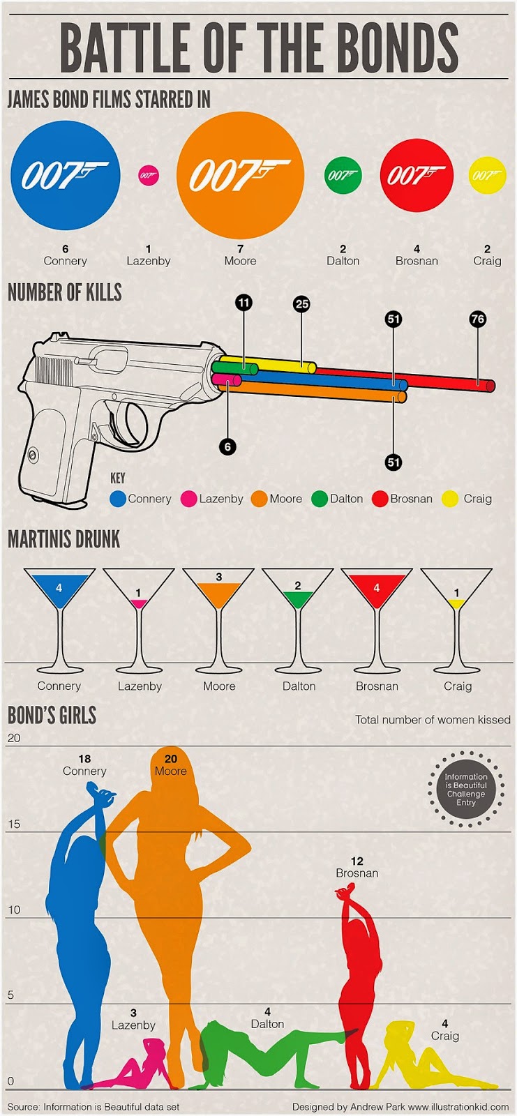

Fig 8

This is a fab Bond-themed info graphic which uses icons from the films to present the data related to each of the Bond actors.  Not only does it showcase the information clearly but it hits on a note of recognition for Bond fans and is recognisable to anyone familiar with the films.  It's easy to pick out the information relating to each character due to each having a colour assigned.

Fig 9

David McCandless' "Who Rules The Social Web" is a fun look at which websites each gender has a higher usage of across the board.  The proportional bar graphs directly represent the subject matter, in that McCandless uses the universal pictograms for male and female as the symbols to represent figures. What is interesting (but probably not surprising!) is that women are much more avid users of social media which revolves around conversation, photos and generally sites that are for "journalling" life and sharing what they are up to.   Men, on the other hand, use sites that centre around conversation with others and sharing work. 

A different take on the subject of gender is the work below about rape statistics and the small percentage of women who speak out compared to instances of rape.  The size of the circles are directly related to the number in the circle, which is a sobering fact when we note the differences in size between the estimated number of rapes and the number of rapists convicted.  
Extra information is placed at either side of the central data in a muted grey, which means that the piece presents all the essential facts but is not too busy on the eyes.

Fig 10


References

Fig 1 Park, Andrew. 2014. Information design project for Sticky Content Client the Post Office - Holiday Costs Barometer 2014 [online] Available at:  http://www.illustrationkid.com/page2.htm
[Accessed 17th Feb 2015]

Fig 2 Park, Andrew. 2014. Infographic looking at ways to boost Wi-Fi produced for Currys Tech Talk blog [online] Available at:  http://www.illustrationkid.com/page2.htm
[Accessed 17th Feb 2015]

Fig 3 Park, Andrew. 2014.  Employment infogrpahic for PA client Investec [online] Available at:  http://www.illustrationkid.com/page2.htm
[Accessed 17th Feb 2015]

Fig 4 Faydi, Clement. 2011.  Ahead App [online] Available at:   https://www.behance.net/gallery/1092739/Ahead-App
[Accessed 17th Feb 2015]

Fig 5 Bureau Oberhauser. 2012. Brockhaus Encyclopedia [online] Available at:   https://www.behance.net/gallery/2726303/Brockhaus-Encyclopedia-Infographics
[Accessed 17th Feb 2015]

Fig 6 Bureau Oberhauser. 2012. Brockhaus Encyclopedia [online] Available at:   https://www.behance.net/gallery/2726303/Brockhaus-Encyclopedia-Infographics
[Accessed 17th Feb 2015]

Fig 7 Bureau Oberhauser. 2012. Brockhaus Encyclopedia [online] Available at:   https://www.behance.net/gallery/2726303/Brockhaus-Encyclopedia-Infographics
[Accessed 17th Feb 2015]

Fig 8 Unknown

Fig 9 McCandless, David. 2014. Who Rules The Social Web? [online] Available at:   http://www.informationisbeautiful.net/2014/who-rules-the-social-web-2/
[Accessed 17th Feb 2015]

Fig 10 McCandless, David. 2012.  Rape: A Lack of Conviction [online] Available at:  
http://www.informationisbeautiful.net/visualizations/rape-a-lack-of-conviction/
[Accessed 17th Feb 2015]


CreativeBloq infographics

More noteworthy info graphics found through this article on CreativeBloq.com.  Again, I chose many for their visual style but there are some excellent examples of handling different kinds of information here.

The Maginificent Multitude of Beer by Pop Chart Lab, 2010


This is a great example of how to deal with a huge amount of information which centres around the same core subject.  At first glance it appears a little overwhelming, but the linking lines help to tie all the data together.  As long as you can follow a line with your eye, the relationships between different beers and their ingredients/flavours/etc can be identified quickly.  Similarly, Anna Vital's "How To Be Productive" (below) uses linking lines, but the added images help to anchor each stage and gives the impression of a "step by step" process.   The splitting into categories is helpful to understand and process each bit of advice, as well as setting the basis for weaving the diagram together. 

How To Be Productive by Anna Vital, 2013


Why Your Brain Craves Infographics by NeoMam Studios, 2014

This piece is a bit of a find, as it is an infographic about the effectiveness of info graphics (hello reference section for my dissertation!).  Much in the same way that those over at Happify craft their quantity-led facts into illustrations and emphasised numbers, so too do NeoMam studios, and in the process making the case for illustrated information everywhere.  Also, you'll have seen in my work so far that I love a good banner title...


The 3-split layout is effective as it usually features enough facts to be seen as "enough evidence", but little enough that the eye and mind can take it in without being confronted with too much data.  The illustrations are very cute and quirky, but simple enough that they convey the theme of a section and aren't overly elaborate.  I love this one of the grumpy man with his data-overloaded mind.  


As the fact demonstrates, the use of colour visuals here is central to helping highlight information.  Importantly, the designers have stuck to a core colour scheme of just four colours (plus white and a pale blue for some backdrops) which helps in this case as text and illustration are linked to each other through corresponding hues (see medicine labels diagram below).  There are some cases where more colours can work, for example in highly detailed illustrations or in the likes of Happify's stuff, but as can be seen throughout this blog post the rule of thumb is pick a set palette, analogous or complementary, and stick with it thoughout.  


323%.  Can't argue!


Fume Leads to Death by Liow Heng Chun, 2013

Hen Chung's illustration style is simple but effective, focusing on thick black outlines which work very well as icons.  The combination of black and red is a nod to the dark nature of the subject matter, which surrounds the health implications of smoking.  Hen Chung's Behance page for the project says his assignment was to present all the warning facts about smoking in a way that would not put people off based on the visuals - given how nice the info-graphic is to look at, I'd say he's succeeded.  The outline illustration of the human anatomy works particularly well as it forms the centre of a diagram which basically says "Here are all the things that will go wrong in your body if you smoke." 


Using proportion graphs to represent how the issue strikes on a global scale helps to highlight the problem, as well as display the data according to gender statistics and age range in smokers. 


Why Green Growth by the World Bank, 2012

This pretty infographic uses sectioning and grid layouts to arrange and align its many facts on the page.  This is an important element of designing an infographic that is very data heavy - not all of the facts on here are easy to categorise so it is important that the eye can process them as individual factoids on a screen. 


The image below is to persuade countries to choose green energy, so the scene presented is an idyllic metropolitan environment which seems to have the best of both worlds.


Numbered diagrams (above, below) are helpful if the information in text needs to be expanded on or can't be summed up simply.  Can't believe I haven't thought of this in my own work yet! Below there are also some nifty diagrams which pair an illustration with a pie chart or bar graph, which helps the viewer to instantly link the numbers to the issue and has a more persuasive effect.  This is important if the subject matter is cautionary, such as the high cost of a hectare for building a barrier for floods. 


Dribbble Design by Jamie Brightmore, 2014

This is a pared down info graphic for the portfolio site Dribbble, which features subtle little interactive elements.  For example, in the image below I took a screen shot of my mouse hovering over the "Insight" tab, which brings up a little speech bubble in the corresponding section of the basketball.  This helps lead the eye to the "Insight" section directly, as it is a bit of a detour for the eye to follow the guiding line to the section.


Another nice little interactive element when the basketball is hovered over - this was when my mouse was over the "Typographers" section.  I really need to look into whether or not InvisionApp does interactivity, as touches like this are surprising, and on first try can be a little delightful.


Rollover buttons - Another nice little touch to add in extra information without compromising on the minimalist look.  This section also serves as an introduction to the core elements of Dribbble in a way that is easy to digest.

Air Bnb Then and Now by AirBnB (Unknown) , 2013

This very stylish info graphic by an unknown for AirBnB showcases their millionth night booked milestone.  There is a good combination of quantified data with illustrations here, and some of the ways in which the booking facts are presented is very creative (see the "Types of Listings" ruler graph and the corresponding "Other" section).  The colour palette is quite sugary but the deep pink brings is out of that slightly, and the result is a slightly muted palette that pops against the neutral background instead of using bright colours.  


This isometric style map is an inventive way to present the information on locations around the world,  without looking like your typical annotated map.  What helps is that AirBnB could have gone for the very boring approach to presenting all this information, but in order to make it appealing and have a personable tone they picked out all the surprising facts that would resonate with most people.  Put simply, applying the data to real situations brings it to life in the reader's mind.


At the bottom of this image the list of schools, professions and employers is shown by opacity, which is a novel approach!


Atlantis World Fair by Frank Chimero @Lost World's Fairs, 2010

This is a web based info graphic, made (I think) using Adobe Muse.  I love love love the texturing used here as well as the quirky style, which reminds me of Wes Anderson movies.  


References

Pop Chart Lab, 2010.  The Magnificent Multitude of Beer [online] Available at: http://media.creativebloq.futurecdn.net/sites/creativebloq.com/files/images/2013/10/megabeer.jpg
[Accessed 18 Feb 2015]

Vital, Anna.  2013.  How To Be Productive [online] Available at: http://media.creativebloq.futurecdn.net/sites/creativebloq.com/files/images/2013/10/productive.jpg
[Accessed 18 Feb 2015]

NeoMam Studios, 2014.  Why Your Brain Craves Infographics [online] Available at: http://neomam.com/interactive/13reasons/
[Accessed 18 Feb 2015]

Liow Heng Chun, 2013.  Fume Leads To Death [online] Available at: https://www.behance.net/gallery/Infographics-Fume-Leads-To-Death/8759231
[Accessed 18 Feb 2015]

Unknown for The World Bank, 2012.  Why Green Growth?  [online] Available at: shttp://media.creativebloq.futurecdn.net/sites/creativebloq.com/files/images/2012/08/infographic45a.jpg
[Accessed 18 Feb 2015]

Unknown for Air BnB, 2013.  Air BnB: Then and Now [online] Available at: http://media.creativebloq.futurecdn.net/sites/creativebloq.com/files/images/2013/02/airbnblarge.jpg
[Accessed 18 Feb 2015]

Chimero, Frank.  2010.  Atlantis World Fair [online] Available at: http://lostworldsfairs.com/atlantis/
[Accessed 18 Feb 2015]


Infographics for the web

This post is a little summary from my favourite pieces from the article 44 Useful infographics for web designers.  I chose the works featured below mostly because of visuals, but also for the way they handled the presentation of the information.  There are several examples in here I will definitely be taking guidelines from.

The Science of Colour by Paper Leaf, 2010


This is a small snippet of a much longer info-graphic, which uses lovely shading and a mix of slab serif fonts to create visuals that have a good depth and make for a read that is easy for the eyes.  The colour wheel has been seen time and time again but the way the artist has rendered the wheel gives is a fresh appeal.  Here the background has been kept neutral so that the colours can take precedence and there is no distraction.

 The type is stylish and not too restrained, with slab serif in the titling making it very legible on screen.  The type combines with the illustration to create a piece that is informative but doesn't feel "instructional".  Furthermore, the copy is worded in a way that encourages the reader, assumed to be a designer, to think about how the information can be applied to their own work - e.g "Use warm colours in your designs…" - which adds to the friendly, helpful overall tone of the info-graphic.  This is the kind of approach I am aiming for, as much of my work will feature brain science which reads like jargon to many people.

Why You Should Care About Typography by Noodlor, 2011


The vintage look of this info-graphic by Noodlor is very much a stylistic choice, but the combination of a muted palette and  a little vignette around the edges created a backdrop for a real mix of type and letters.  The vignette on this really adds to the look and makes sure that the muted colours don't get lost on the screen, as well as giving a little hint of skeumorphism which I do really like.  Had the designer used more colours or in a brighter palette, the eye would struggle to take all of this type-related info in.


Notice that titbits of information are usually framed in boxes, which guides the eye to certain points and anchors each section on the page.  This is helpful as in places some of the information seems a little random or unrelated to the rest of the content on the page.


Design of the Times: 2014 Web Design Trends by Unknown, 2014


I love the diagrams in here - quite similar to what I have been working on myself in terms of the basic shapes used on a circle.  The mix of neutral shades and very bright orange work together to give the information pops of colour, without being too much on the eye.  Strong colours on screen can often "vibrate" but the brightness of the oranges has been kept on the lower side to avoid this, instead using the background to contrast.  The dotted-line graphs are something I have never seen before and they are a fresh way to present the traditional pie chart as well as accentuating the image within the circle - clever!   The information around the charts could be arranged in a way that is a little more consistent as it is very left-heavy at the moment - I might have kept the diagrams in separate sections of the info graphic.


This semi-projected view makes it a lot easier, and more interesting, for the reader to understand the layout.  By literally breaking it down, the individual elements of the page and what they do can be better processed by the reader.  There is also potential here for more arrows with extra information, as my work will be.  I might alter the brain and body illustrations in this way and see how it works out.

Diagrams such as the one below show the app being used "in context", which helps the reader imagine themselves using it.


Flat vs Realism by intact Design, 2013

"Flat vs Realism" made the rounds in 2013, reflecting the two top trends of the year.  I chose it because I am still working in flat design but I have seen some lovely work that bridges the gap between the two, plus I love the way the subject matter is presented as characters as this makes the "story" so much more interesting. 


References

Paper Leaf, 2010.  The Art of Color Co-oridination [online] Available at: http://www.script-tutorials.com/infographic-the-science-of-color/
[Accessed 19th Feb 2015]

Noodlor, 2014.  A Quick & Comprehensive Type Guide [online] Available at:
http://www.fastcodesign.com/1664719/infographic-of-the-day-why-should-you-care-about-typography
[Accessed 19th Feb 2015]

Unknown, 2014. Design of the Times: 2014 Web Trends [online] Available at:
http://www.webjuicers.com/uncategorized/infographic-looks-at-web-design-trends/
[Accessed 19th Feb 2015]

inTacto Design, 2013.  Flat vs. Realism [online] Available at: http://www.flatvsrealism.com
[Accessed 19th Feb 2015]


Monday, 16 February 2015

The Beauty of Data Visualisation by David McCandless - TED Talk

One of my "tasks" set by Simone this week was to look into the work of David McCandless, an information designer who has published books on the topic and is a recognised expert in the field.  McCandless has a good TED Talk from 2010, which is my starting point for his work.  The opening of the talk sums up the benefits of information design concisely. "Visualising information so that we can see the patterns and connections that matter, so that we can design the information so that it makes more sense, tells a story, or allows us to focus only on the information that is important."
In the talk, McCandless takes us though some infographics he has designed, why he has designed them and how they help an audience comprehend information better.

The billion-dollar-o-gram


The billion-dollar-o-gram was created out of McCandless' frustrations with the financial reporting on a global scale.  "These numbers are meaningless without context - £500 billion for this pipeline, £20 billion for this war…it doesn't make ay sense, so the only way to understand it is visually ad relatively."

The colours represent the motivation behind the money - red is giving money away, purple is fighting, green is profiteering.  McCandless points out that now they are presented with a relationship between size and cause, we can also see other patterns between them, for example OPEC's $700 billion revenue compared to their teeny-tiny $3 billion climate change fund.  The diagram shows, very starkly, how small OPEC's contribution to an important issue is compared to how much they are keeping for themselves.   A similar comparison is the $308 billion in charity donations by Americans compared to $120 of foreign aid payments by the government.  The statistic which raised a chuckle but is also very alarming is the projected cost of the Iraq War vs the actual cost.  All of this might have been lost in context had McCandless not created this info graphic.

Public fears in the media


McCandless' graph of fears was an interesting take on the fears of the public as portrayed in the media over a timeline.  Very entertaining are the green peaks, which represent asteroid collisions!  What I find most interesting about this graph is that while it is very scientific it is not a traditional way for a subject such as fears to be presented.  In my mind, this kind of thing would be presented in a similar format to those inforgraphics seen on Happify.com (which I'm going to write about soon), with a balance of illustration and text.  But, as McCandless notes, presenting data in this way is not only pleasing to the eye as it sees patterns, but it also allows us to find links between those patterns.


One such example is the twin peaks which occur at the same time every year in the red area, which represents video games.  Every year in April and November, there are spikes in fear surrounding violence related to/spawning from video games.  The November peak is apparent with the run up to Christmas, as big releases are strategically played up for the pre-Christmastime shopping.  The April peak, however, is interesting and more chilling as it relates to the anniversary of the Columbine high school shootings, which was notoriously inspired by video games and has at times sadly inspired copycat shootings.  As news coverage highlights the anniversary, the apparent relationship between the shooting and video games (while disproved) stirs up fears in the public of a repeat event.

A similar fear-centred pattern is the gap which starts in September 2001, as the attacks on the world trade centre put everything into perspective when people "had something very real to be afraid of."

The bandwidth of senses


Senses as bandwidth was a surprise to me -  of course we know that senses have a kind of hierarchy how how impactful each one is to the information we receive, but seeing them presented as bandwidth was a charming spin on the subject.   It is very easy to gauge how much impact sight has in comparison to hearing and smell - much more so than if it were written on paper in the typical language that would centre around percentage and values.

Evidence of supplements for health


A balloon race chart makes for an easy comparison as to which extracts/substances have the most evidence behind them, in relations to the claims made when marketing them.  The balloons higher up have the most evidence behind them.  The graph can be manipulated to show specific information, for example info relating to heart health, or only the balloons which contain natural substances.  What I found interesting about this one is that all the information is stored in a Google Doc, so McCandless can  update the document at any time and the information there will be translated into the graphic. 


Political charts


McCandless designed the "Right vs. Left" politics poster as a way to present the conversation around politics in a fresh way which affords direct comparison for each area.  For example, the "Family" sections can be compared directly due to the mirrored layout and repeated images.  McCandless says: "There is something very unthreatening about seeing a political perspective as opposed to being told about one or listening to one…it's even fun to engage in them because it's visual."  The talk is summed up by a great quote, which is quite applicable to my own project at the moment: 
"Information design is about solving information problems." I feel that I can call the topic of mindfulness an information problem to some extent, as there is so much of it there that people could know about but it is usually presented as a wall of text so many people don't peruse the data.  

My next step will be to read McCandless' books as recommended by Simone, so at the moment I am trying to track down any copies I can be lent or otherwise ordering them online.  McCandless has a blog, Information is Beautiful, which charts inforgraphics he has found or made, so that will be a good source for this area of research. 

References

TED Talk: McCandless, David. 2010.  The Beauty of Data Visualisation [online video] Available at:
http://www.ted.com/talks/david_mccandless_the_beauty_of_data_visualization?language=en
[Accessed Feb 15 2015]

Images: All screen shots from the above TED Talk, with the exception of the last image under "Political Charts":

McCandless, David and Posavec, Stephanie.  2010.  Inevitable Capitalist Agenda or Left vs. Right
[online image] Available at:
http://www.informationisbeautiful.net/visualizations/left-vs-right-us/
[Accessed Feb 15 2015]