This week's meeting went over what I have been looking in mindfulness apps (see previous posts), which Simone seemed happy with. Last week she asked me what specific element of mindfulness I was going to look at, and since looking through the apps and how they work I have decided that my work will centre around encouraging short breathing exercises and body-scan exercises. This is because it is the easiest way to get into mindfulness, as well as probably being the simplest aspect of the practice for newcomers to get their heads around. In the past I have been taught, by way of an introduction to being mindful, to focus on the sensation of a warm cup of tea in my hands, or to turn all of my attention to the feeling in my toes. Little things like this are a very accessible to everyone and don't require a lot of effort, so are well suited to the area I am focusing on.
My main question this week was about how the practical side of things would inform the research. The lecture we had earlier raised this point, and I realised I am not so sure about this. I think in order to answer this I need to press on with practical work - I have made a tentative start, but this week has turned out to be all about the research! Simone suggested looking at how traditional media and digital media go back and forth, particularly with print media and app design. I reckon will be an interesting place to go.
As I am leaning more and more towards creating content for an app (alongside printed posters as advertisement), we discussed where I could get hold of a tablet in time for the degree show, as I don't currently own one. I have emailed to ask if I can request an iPad mini, so fingers crossed! This also led on to what I could put on business cards in relation to the project and what the "take away" would be for people. I have been brainstorming little slogans which could be used to attract people, so at the moment I am thinking a mix of them would be a nice touch and Simone agreed.
With regard to case studies, it was agreed that I would do extended versions of some of the apps I just blogged about. Since I am also looking at branding and persuasion, there is probably scope to go back and do case studies on some of the stuff I looked at last semester. Simone also recommended I look up existing academic journals on app design and see what I can find, as well as reading design blogs such as Fast Company. The idea of reading spiritual, new-age books to get a grounding in Bhuddism-based mindfulness was also floated.
My reading for the next fortnight will also cover more of the history of graphic design, as the point was made that in order to go forward you have to look at what has been done before. I have lots to do!
Thursday, 22 January 2015
Mindfulness Apps - Meditation Helper, The Mindfulness App and Enso
This post is part 3 of the mindfulness apps blog posts. Here I write about apps that are specifically geared towards meditation in their design and visuals.
Meditation Helper
Meditation helper is a very barebones app but I thought it important to feature nonetheless as it was listed as a useful one. The premise is pretty simple - the user sets a timer for bells to ring at the start and the end of meditation. The bell is a well-known mediation aid, as the sound is natural and fades out slowly which forces the listener to focus hard on the sound. Usually a breath is taken three times during the ringing of the bell, so it is a starting point for the meditation.
I can't say I love the interface here as it is not visually appealing at all. However, the point of the app is to help the user meditate, so it would follow that there is no use for images or well-chosen text.
I can't say I love the interface here as it is not visually appealing at all. However, the point of the app is to help the user meditate, so it would follow that there is no use for images or well-chosen text.


The Mindfulness App by MindApps
This app is streamlined to focus just on meditation, without much extraneous information as seen in Headspace and MentalWorkout. The interface is really suited to smartphones with much of the same type and similar menus designs to the iPhone interface. The header type is slim but because the letters are tall it reads easy and appears kind of gentle. This app is more suited to people who are aware of mindfulness meditations and the benefits they bring, hence the minimal approach. I don't see my own work following this look as a whole, although that glowy dotted circle on the blue background is really relaxing to look at!


Enso
Enso is much like the apps above, but a lot more pretty in design in my opinion. It is designed to work well with the iPhone interface in particular, with similar on-off sliders and breaking up of sections. What I really like is the way the timer is set up and presented (middle and right screenshots) - much more visually fitting than a timer countdown. The simple, sleek visuals are something I hope I have time to explore too, because while I'm taken with the personable, quirky visuals as shown in the Headspace app, I also think there is potential to create something that is very stylish as it may appeal to the target 18-35 market who would perhaps like their apps to feel "grown up".

References
Kazmucha, Allyson. 2014. Imore website. "Best meditation apps for iPhone: Clear your head and relax better than ever!" [online] Available at:
http://www.imore.com/best-meditation-apps-iphone-omvana-headspace-breathful-and-more
[Accessed 19th Jan 2015]
Unknown, 2014. iTunes website. "The Mindfulness App" [online] Available at:
https://itunes.apple.com/gb/app/the-mindfulness-app/id417071430?mt=8
[Accessed 19th Jan 2015]
Tlaka, Stephany. 2014. Mindful website. "Mindfulness: Apps for That?" [online] Available at:
http://www.mindful.org/mindful-magazine/mindfulness-apps
[Accessed 19th Jan 2015]
Mindfulness Apps - Bhuddify, AEON and Mental Workout
Part 2 of posts reviewing mindfulness meditation apps for smartphone & tablet.

Described as "mindfulness for the digital generation", Bhuddify was created by Rohan Guintillake and his team as a response to people who told him that they "were interested in mindfulness and meditation but didn't do anything about it because they thought it took too much time and was too hippy." Thus it is an excellent example of an app I should be looking at! The app's site says that Bhuddify is an "award-winning mindfulness (app)" with over "80 guided meditations custom made for wherever you are and whatever you're doing - traveling (sic), at work, at home, going to sleep, and much more. " See a video here for a walkthrough of the app.
The newest version of the app offers a mix of guided and unguided meditations, in four kinds (clarity, connection, stability and embodiment) and four "situations" (commuting, walking home, at home, at the gym).
What is so different about Bhuddify compared to other apps is the approach taken to the design and the way the information is presented. The colour wheel gives a visual hint at the idea of living more fully with the circle motif as a colour wheel, as well as neatly sectioning each topic according to a colour that could be associated with it. The design reminds me of data design, so I was not surprised to learn that it was indeed created by an information designer who specialised in data representations.
The little houses in the background are charming and give the screen more depth - to me they are purely decorative but I think here it works as they add that little personable touch.


Martin, Alex. 2011. Bhuddify website. "bhuddify is go!" [online] Available at: http://buddhify.com/buddhify-is-go/
[Accessed 19 Jan 2015]
Unknown, 2014. 7 Days of Goodness website. "Leer mediteren met =Bhuddify 2 (iOS app)" [online] http://www.7daysofgoodness.com/leer-mediteren-met-buddhify-2-ios-app/
[Accessed 19 Jan 2015]
Unknown, 2012. Know Your Apps website. "Bhuddify: East meets west in the most unlikely of ways." [online] Available at: http://www.knowyourapps.com/reviews/buddhify/
[Accessed 19 Jan 2015]
Unknown, 2014. iTunes website. "AEON Mindfulness App." [online] Available at: https://itunes.apple.com/us/app/aeon-mindfulness-app/id834258846?
[Accessed 19 Jan 2015]
Bhuddify BY 21awake
The newest version of the app offers a mix of guided and unguided meditations, in four kinds (clarity, connection, stability and embodiment) and four "situations" (commuting, walking home, at home, at the gym).
What is so different about Bhuddify compared to other apps is the approach taken to the design and the way the information is presented. The colour wheel gives a visual hint at the idea of living more fully with the circle motif as a colour wheel, as well as neatly sectioning each topic according to a colour that could be associated with it. The design reminds me of data design, so I was not surprised to learn that it was indeed created by an information designer who specialised in data representations.
The little houses in the background are charming and give the screen more depth - to me they are purely decorative but I think here it works as they add that little personable touch.
Interestingly, Bhuddify also gives users the opportunity to rate their own experience such as how well they concentrated and how balanced they felt.
AEON by
AEON bases itself around the observance of negative thoughts, and the idea that they can be "observed" and accepted rather than going to the core of a person's feelings. This is a key element of mindfulness so while I don't find the interface hugely exciting I really like this idea.
"The AEON app helps users in practising a mindfulness technique that requires individuals not to react in response to their thoughts, but to be away of them and observe them while they are going away (distancing from thoughts)." (2014)
What is effective is the image on the right, where the user's thought is displayed after being typed in on the left. The font gives it a personal element to it, and the italics somehow make it look like it is being said quietly or silently. Over the course of a few minutes, the text fades into the paper, reflecting the idea of thoughts passing through someone's mind. In contrast to this, the first stage of the app seen on the left feels smartphone friendly and looks a bit like the "Tasks" section most phones come with.
Mental Workout by Stephen Boding
Like the name suggests, Mental Workout evokes a kind of gym mentality in its look, which now I think about it is very fitting for mindfulness. Phrases like "freedom from stress" and "Live like never before" are written in a no-frills sans serif type, which to me gives the app a feeling of being very suited to a focused and goal-orientated user. The icon images follow this idea as they are simplistic and remind me of icons often seen on fitness equipment. Overall the look of the app feels very focused and simple, so the user feels like Mental Workout is very goal-orientated. In comparison to other apps I have looked at it is designed in a way that makes the user want to take their practice a lot more seriously, as it is likened to working out at the gym which is associated with hard work to achieve results.
The mix of blue, green and grey means that the app has relaxing colours but also has a focus to it's theme. Using the picture of Stephen Bodian (as seen above) gives the app credibility, as Bodian is a leading figure in contemporary meditation and mindfulness. I like that the app asks the user questions at the beginning to gauge their starting level - I wonder if this could eventually feature in my own prototype. Overall I feel that while MentalWorkout is less personable and friendly-looking than other apps I have written about, there are elements that would work effectively and encourage a different kind of customer to try meditation. As I said previously, the mix of image and type suggests a gym goer kind of personality, which is often far removed from those who are into the new-age practices. Here the most important elements of mindfulness are kept and communicated successfully to the audience, without any of the traditional associated visuals. Judging by the success of the app, and Bhuddify too, I can put to rest any worries about moving away from the pre-conceived, spiritual/nature images typically used in mindfulness materials.
References
[Accessed 19 Jan 2015]
Unknown, 2014. 7 Days of Goodness website. "Leer mediteren met =Bhuddify 2 (iOS app)" [online] http://www.7daysofgoodness.com/leer-mediteren-met-buddhify-2-ios-app/
[Accessed 19 Jan 2015]
Unknown, 2012. Know Your Apps website. "Bhuddify: East meets west in the most unlikely of ways." [online] Available at: http://www.knowyourapps.com/reviews/buddhify/
[Accessed 19 Jan 2015]
Unknown, 2014. iTunes website. "AEON Mindfulness App." [online] Available at: https://itunes.apple.com/us/app/aeon-mindfulness-app/id834258846?
[Accessed 19 Jan 2015]
Tuesday, 20 January 2015
Mindfulness Apps - Headspace and Pine
As I plan to create a mock-website that will be designed for tablet and possibly smartphone screens, looking at what is already out there in terms of mindfulness apps has been useful. Not only have I been able to see how the content is designed for the tablet/smartphone screen, but also the visuals that each app creator has used to encourage today's audience of app users. Looking at these was really useful as some of these have been successful and are pointers to a style I could use myself to attract my target audience. I found a lot of these apps through this post on Minful.org.
"Headspace is so appealing because it is meditation made easy. You don't have to chant, light incense, dress like a monk, or take part in any other weird misconceptions we all have about meditation in the western world. " (Caddy, 2014) The success of the app is also indicated by it's expansion into other avenues: "…Headspace has teamed up with big brands to deliver the same experience in unexpected places, like Virgin Atlantic flights to calm the nerves of those scared of flying, and huge companies in an attempt to ease corporate stress." (Caddy, 2014) Particularly handy is the SOS feature with 2 mins of guided mediation; on the go sections. Puddicombe says there are no social media features because mediation is much more personal, but up to five "buddies" can follow you on your account to help encourage each other.
I signed up to Headspace on the homepage and was greeted by a very cute on-screen character who gave me a "tour" of the site and what is available. The colours are muted here and work well with the eggshell shade in the background. Many of the icons are created to look faux-3d (vector illustrations with imitation shadows). As they are very crisp and clean, the font used for the header text has to match this so it is a sans serif. Body text is in italics to contrast this and break up the reading.


Overall the images are contemporary, charming and cute, which is deliberately very removed from the traditional visuals the wider public would associate with mindfulness. Recently I have been asking myself if completely turning my back on all the culturally associated icons and imagery was a good thing, as some of the "core values" of the practice might be lost, particularly the healing and spiritual ones. However, Headspace's popularity shows that taking a new approach to meditation visuals can be successful and still retain the heart of the practice.

The Headspace site also offers series of meditations aimed at various aspects of life, shown below. An example is the SOS meditation for panic moments, or the walking meditations for when the user is out and about.


The website also has some information graphics on its homepage, which link to extensive information on the benefits of mindfulness practice. It is made very clear that meditation is something that can only yield good results, and benefits are in abundance. They way this is presented, as seen below, is quite a change from the wall of text as seen on the Mindfulness Scotland site.


I have yet to try it out on an iOS or Android device, but in the mean time here are some images I found of Headspace running on a smartphone. I am hoping to borrow my boyfriend's Nexus tablet in the next few days and try some of them out - after all I can't find out much about navigation from screen shots.


References
Caddy, Becca. 2014. Shiny Shiny. "Headspace V2: How an app could improve the health and happiness of the world." Available at: http://www.shinyshiny.tv/2014/06/headspace-v2-how-an-app-could-improve-the-health-happiness-of-the-world.html
[Accessed 20th Jan 2015]
Tucker, Heather. 2013. Appstorm website. "Grab Some Calm on the Go with Headspace." Available at: http://iphone.appstorm.net/reviews/lifestyle/grab-some-calm-on-the-go-with-headspace/
[Accessed 20th Jan 2015]
Puddicombe, Andy. 2012. "Andy Puddicombe: All it takes is 10 mindful minutes." [online video] Available at: https://www.ted.com/talks/andy_puddicombe_all_it_takes_is_10_mindful_minutes
[Accessed 20th Jan 2015]
Butalid, Renjie. 2015. Side by Side website. "Living With Intention Every Day" http://sidebysidemh.com/2015/01/09/living-with-intention-every-day-by-renjie-butalid/
[Accessed 20th Jan 2015]
Lewkowitz, Michael. 2015. Igniter website. "How Are You Doing?"
http://lewwwk.com/post7583
[Accessed 20th Jan 2015]
Unknown, 2013. The Huffington Post "The 8 best apps for a calm, focused mind." http://www.huffingtonpost.com/2013/12/12/the-10-best-apps-for-a-ca_n_4426410.html


Headspace by Andy Puddicombe and Rich Pierson
Headspace is considered one of the leading mindfulness apps on the market at the moment. Created by mindfulness expert Andy Puddicombe, the latest version had it's launch party at the Royal Society of Medicine, so you know it's good. "Headspace…(is a) way to introduce the age old discipline of mediation into the mainstream and help people to focus more, sleep better, stress less and live a happier, healthier life." (Caddy, 2014)."Headspace is so appealing because it is meditation made easy. You don't have to chant, light incense, dress like a monk, or take part in any other weird misconceptions we all have about meditation in the western world. " (Caddy, 2014) The success of the app is also indicated by it's expansion into other avenues: "…Headspace has teamed up with big brands to deliver the same experience in unexpected places, like Virgin Atlantic flights to calm the nerves of those scared of flying, and huge companies in an attempt to ease corporate stress." (Caddy, 2014) Particularly handy is the SOS feature with 2 mins of guided mediation; on the go sections. Puddicombe says there are no social media features because mediation is much more personal, but up to five "buddies" can follow you on your account to help encourage each other.
I signed up to Headspace on the homepage and was greeted by a very cute on-screen character who gave me a "tour" of the site and what is available. The colours are muted here and work well with the eggshell shade in the background. Many of the icons are created to look faux-3d (vector illustrations with imitation shadows). As they are very crisp and clean, the font used for the header text has to match this so it is a sans serif. Body text is in italics to contrast this and break up the reading.
Overall the images are contemporary, charming and cute, which is deliberately very removed from the traditional visuals the wider public would associate with mindfulness. Recently I have been asking myself if completely turning my back on all the culturally associated icons and imagery was a good thing, as some of the "core values" of the practice might be lost, particularly the healing and spiritual ones. However, Headspace's popularity shows that taking a new approach to meditation visuals can be successful and still retain the heart of the practice.
The Headspace site also offers series of meditations aimed at various aspects of life, shown below. An example is the SOS meditation for panic moments, or the walking meditations for when the user is out and about.
The website also has some information graphics on its homepage, which link to extensive information on the benefits of mindfulness practice. It is made very clear that meditation is something that can only yield good results, and benefits are in abundance. They way this is presented, as seen below, is quite a change from the wall of text as seen on the Mindfulness Scotland site.
Changes in size, colour, boldness and italics highlight the information, but the mix of text and illustrations mean that this is not overwhelming to the eye.
The information presented here is the kind I would potentially use in my own campaign visuals. The one I found a big potential for is the snippet near the bottom about "smart drugs" used to enhance academic performance. It is proven here that mindfulness would be a safer, free alternative. The illustration I also really like - the way the mind's focus is portrayed as a piece of string or dotted line, loopy when distracted and straight when focused. I found some early sketches in last semester's sketchbook with a similar idea which I will try working on again as part of practical development.
This call to action screen is effective as the illustration evokes a positive mood, and the information reads that mindfulness can change the brain. The big green "sign up for free" button contrasts all the other colours and almost shouts "click me!"
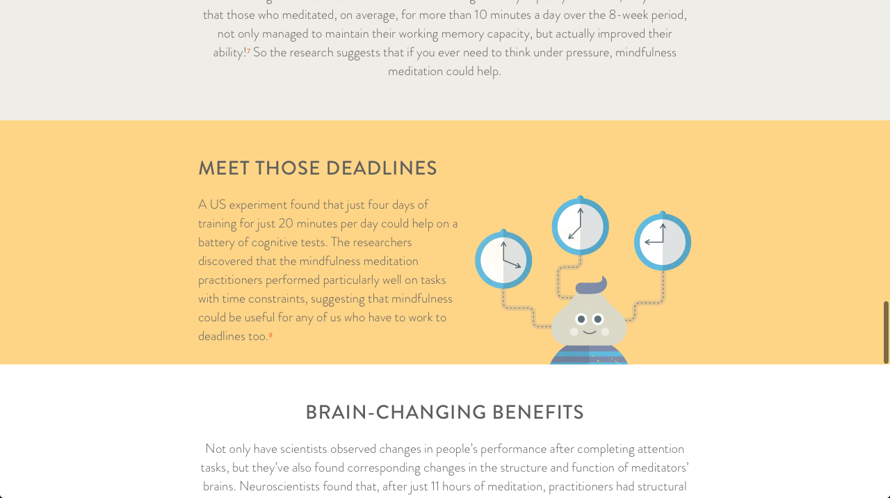
Mindfulness has benefits for those under pressure, as shown by this info screen.
I have yet to try it out on an iOS or Android device, but in the mean time here are some images I found of Headspace running on a smartphone. I am hoping to borrow my boyfriend's Nexus tablet in the next few days and try some of them out - after all I can't find out much about navigation from screen shots.
Dashboard screenshots are colourful and organised in a way that is easier to read. Some of the pages do feel a bit crammed full to me, however the result is a few concise pages detailing the user's progress.
Pine
Renjie Butalid's PINE app takes a different approach to the social element of meditation practice, while also managing to keep the focus on the user themselves. The app is designed to encourage users to "check-in" with themselves on a daily basis, aiming to attain a better sense of well-being. "In a safe and private space, PINE enables you to take the proverbial step back for a few seconds each day to reflect and answer the question "How are you doing?…With PINE, the core of the experience is making it as simple as possible to build the daily habit of checking in and connecting with yourself, while knowing your friends and family are doing the same."
The app charts your streak of "check-ins", charting your mood with symbols as below. Everything is quite simple in illustration and layout, with type to match.
Of the app itself, one of it's developers Michael Lewkowitz writes that: "…it's private. These are my experiences, my thoughts, expressed in a way that's unfiltered and unedited. Not shared, they are raw and real. Second, the simplicity. I can check in just about anywhere at any time, and I can do it in a few seconds whether I have anything to say or not. Third, while it's private, I'm not alone. I can't see what my friends are saying, but I know they are checking in." (Lewkowitz, 2015)
Pine has a much simpler colour scheme than Headspace, and is closer to the nature vibe we associate with mediation. However the simple vector illustration and user interface manages to be far removed from traditional new age imagery too.
I am just back from a meeting with Simone, and she suggested doing case studies on these apps and others, so these posts may be revisited and expanded on for those. In my next blog post I will write about other apps I have discovered; there are quite a few so it may extend over a few posts.
Caddy, Becca. 2014. Shiny Shiny. "Headspace V2: How an app could improve the health and happiness of the world." Available at: http://www.shinyshiny.tv/2014/06/headspace-v2-how-an-app-could-improve-the-health-happiness-of-the-world.html
[Accessed 20th Jan 2015]
Tucker, Heather. 2013. Appstorm website. "Grab Some Calm on the Go with Headspace." Available at: http://iphone.appstorm.net/reviews/lifestyle/grab-some-calm-on-the-go-with-headspace/
[Accessed 20th Jan 2015]
Puddicombe, Andy. 2012. "Andy Puddicombe: All it takes is 10 mindful minutes." [online video] Available at: https://www.ted.com/talks/andy_puddicombe_all_it_takes_is_10_mindful_minutes
[Accessed 20th Jan 2015]
Butalid, Renjie. 2015. Side by Side website. "Living With Intention Every Day" http://sidebysidemh.com/2015/01/09/living-with-intention-every-day-by-renjie-butalid/
[Accessed 20th Jan 2015]
Lewkowitz, Michael. 2015. Igniter website. "How Are You Doing?"
http://lewwwk.com/post7583
[Accessed 20th Jan 2015]
This past year was the year when meditation and mindfulness finally stopped being seen as something vaguely flaky, vaguely new age-y, definitely California, and fully entered the mainstream.
That shift is backed up by an ever-growing mountain of scientific evidence about the incredible power of mindfulness, meditation, and looking within. The list of all the conditions that these practices impact for the better – depression, anxiety, heart disease, memory, aging, creativity – sounds like a label on snake oil from the 19th century. Except this cure-all is real – and there are no toxic side effects.
In my own life, I’ve found the practice indispensable. I now start every morning with at least 20 to 30 minutes of meditation. But I’ve also found that meditation can actually be done in very short windows of time, even while on the go.
Sunday, 18 January 2015
Meeting with Simone recap
This post is a little late, as I had my first supervisor meeting with Simone on Tuesday. I felt like the meeting went well, I managed to get across my ideas and Simone asked a lot of questions which helped to streamline my focus a bit. After I explained that my project would be looking at the relationship between image and typography, and that my practical project would be to create a body of visuals promoting the practice of mindfulness.
Straight away Simone said that I if I was doing so, I would need to define mindfulness more as at the moment just saying "mindfulness" was too general. She wanted to know what area, and what practices I would be centring my work around. Her next question was how I would present the visuals. At this point I was thinking about a series of posters and information leaflets, however she made the point that leaflets were the kind of thing that would be iced up at a health and wellbeing fair - not the kind of place my envisioned target audience would be going. She suggested that I stick with the posters but instead of a leafier create a series of visuals for the web, such as banner ads and a mock prototype of a website. With regard to that, one of my jobs for this week is to look at web-based mindfulness materials, in particular apps designed for the mobile/tablet market.
Because I was clear about wanting to move away from the traditional new age visuals that can put people off trying mindfulness and meditation, Simone told me to look at what was already out there that was of the style that I did not want to do. Coincidentally I mentioned Hay House books as an example of an aesthetic I don't want to go for, and Simone was able to recommend some spiritual people to look up as she used to work for Hay House in Australia. She had a quick look at some of the names she remembered and we noticed that a few of them were moving into Twitter to connect with more people, so another task for me is to look at how content has been adapted for social media.
With regard to my dissertation topic, Simone recommended going back and looking at the history of graphic design, including Bauhaus aesthetics and making & breaking the grid. If I am to take my designs forward, I need to know their history. She also suggested looking at the Futurists, and in particular concrete poetry such as Zang Tumb Tumb and onomatopoeic poems.
Finally, I was asked to have a clear idea of what my target audience is and where I would expect them to go after viewing and interacting with my work. This I will have to think about a lot more, as it is obvious I need to get real specific.
Saturday, 17 January 2015
Aristotle's modes of persuasion, applied in graphic design (video)
Another video I found really interesting and can potentially be helpful to my practical work was Artistotle's Modes of Persuasion Applied to Graphic Design by Tyler Galloway, who is a lecturer at Kansas City Art Institute and is part of a team who run The New Programme site and blog. As the title hints, the video covers the core of Aristotle's outlined modes of persuasion which centres around the potential for a speaker to appeal to an audience. The opening points summarise the ways in which Aristotle descried persuasion:
"1) Persuasion is achieved by the speaker's personal character when speech is so spoken as to make us think him credible. 2) Persuasion is achieved by the speaker's personal character when the speech is so spoken as to make us think him credible. 3) Persuasion may come through the hearers when speech stirs their emotions." (Galloway, citing Aristotle). The video also introduces the three key themes of persuasion according to Aristotle, which is Ethos, Pathos and Logos.

Another example of the effective use of ethos in graphic design is the label for Levi Strauss jeans. The number of claims of authenticity and quality on the label alone signify that Levi jeans are a brand and a product with longevity and respectability. The Levi Strauss company is arguably an example of extrinsic ethos, where we perceive something, in this case the jeans, based on what we know about the producer. The opposite, intrinsic ethos, is the impression given by the product itself.


Pathos in graphic design could be represented in the famous anti-war poster, "And babies". The sensory type, printed in blood red, frames a question and answer format that at the time was confronting to the public about the Vietnam War. The use of photography establishes credibility and ethos, rather than a subjective illustration. The photograph heightens the realism and pressing immediacy of the situation at the time.
Logos bases itself on clear statement,s logical reasons and factual elements. The message is based on facts, evidence or logic. Examples of logos in graphic design are those that record and organise data - basically visual statements of fact, as seen below.


Many graphic design example use combined ethos, pathos and logos, such as this piece by the Guerrilla Girls. Here we see logos "Less than 5% of the artists…", pathos in the loaded headline question, and ethos through the reputation of the Guerrilla Girls.

References
Galloway, Tyler. 2014. artistotle's modes of persuasion, applied to graphic design [online video] Available at: https://www.youtube.com/watch?v=cXp0PPGnB-0
[Accessed 13th January 2015]
"1) Persuasion is achieved by the speaker's personal character when speech is so spoken as to make us think him credible. 2) Persuasion is achieved by the speaker's personal character when the speech is so spoken as to make us think him credible. 3) Persuasion may come through the hearers when speech stirs their emotions." (Galloway, citing Aristotle). The video also introduces the three key themes of persuasion according to Aristotle, which is Ethos, Pathos and Logos.
Ethos
Ethos, the ethical appeal, centres around elements such as credibility, respectability, likeability, reputation and the quality of the message. In ethos, the author's reputation is respected, independent of the message. In graphic design, this would apply to the use of celebrity spokespeople, or a "stamp of approval" such as the Good Housekeeping seal of approval. Notice how the seal has been re-designed to look like a traditional stamp, to further suggest a history of high quality.Another example of the effective use of ethos in graphic design is the label for Levi Strauss jeans. The number of claims of authenticity and quality on the label alone signify that Levi jeans are a brand and a product with longevity and respectability. The Levi Strauss company is arguably an example of extrinsic ethos, where we perceive something, in this case the jeans, based on what we know about the producer. The opposite, intrinsic ethos, is the impression given by the product itself.
Pathos
Pathos is based around the strong, vivid, and emotional use of language; a sense of sympathy, conjuring of the imagination and sensory visuals which describe smells, sounds and so forth. Put simply, pathos is about how the message connects emotionally.Pathos in graphic design could be represented in the famous anti-war poster, "And babies". The sensory type, printed in blood red, frames a question and answer format that at the time was confronting to the public about the Vietnam War. The use of photography establishes credibility and ethos, rather than a subjective illustration. The photograph heightens the realism and pressing immediacy of the situation at the time.
Logos bases itself on clear statement,s logical reasons and factual elements. The message is based on facts, evidence or logic. Examples of logos in graphic design are those that record and organise data - basically visual statements of fact, as seen below.
Many graphic design example use combined ethos, pathos and logos, such as this piece by the Guerrilla Girls. Here we see logos "Less than 5% of the artists…", pathos in the loaded headline question, and ethos through the reputation of the Guerrilla Girls.
References
Galloway, Tyler. 2014. artistotle's modes of persuasion, applied to graphic design [online video] Available at: https://www.youtube.com/watch?v=cXp0PPGnB-0
[Accessed 13th January 2015]
Subscribe to:
Posts (Atom)