One important thing I still need to hone in on regarding these is the "call to action". QR codes have been integrated so much into prints and products that they have almost lost their inherent "invitation" to scan. This needs some thought given to it, but I would hope when I look more into visual rhetoric and propaganda ideas would start to get going. A great starting point that is very rooted in art would be OBEY by Shepard Fairey, which is a contemporary propaganda movement that I will write about more in another post. In these illustrations I was purely thinking about aesthetics and not about some message behind it.
 |
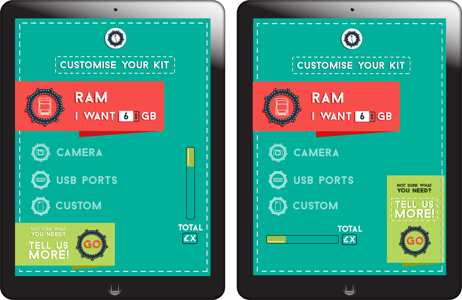
| Figure 1 |
 |
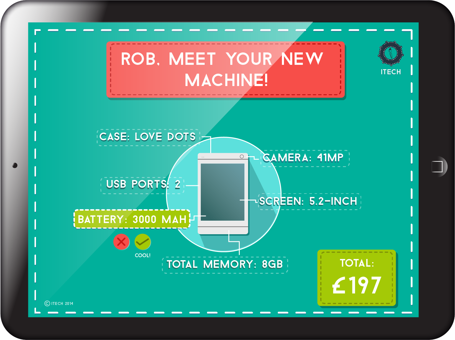
| Figure 2 |
Update: Talking to Simone
To get more insight into what I could do with these I met with Simone, one of my lecturers who has specialised in using QR codes in art prints. She gave me a lot to think about, especially in terms of what the relevance of the codes would be and how the digital content produced in conjunction with the code would show up on different devices. She impressed on me that I shouldn't get caught up in the "coolness" of using QR codes, which was important for me because that was something that had drawn me to using them and it's not really a good enough reason on its own. It was also highlighted to me that the digital content should relate to the medium, and not be, say, a gif for a gif's sake that is linked from a code. It was made pretty obvious to me that there would be a lot of issues with using QR codes, so whether or not I will take the idea further than a mock-up I don't know. Simone also recommended that I give a lot of thought to the theme of the project and then think about whether the QR codes fitted with this, which I admit I have not been doing. I think now might be the time to finally read that Marshall McLuhan book after all…the medium is the message, etc etc!
The conversation also pointed me back in the direction of mixing up traditional mediums (i.e. physical) with digital, and the possibility of using transmedia or cross methods to explore this. I also have to keep in mind how this would work within the context of branding, and what would happen if the link were to expire and the code become redundant. I had initial ideas about using codes to help information on products read better, but I have been told that is already being done and it was implied that I should not go down that route. There is also the issue of the QR code being forever tied to that one URL - if the address of a site changes or the host site shuts down, then the code will not function.
 |
| Fig. 3 The deck at Bar Code Hotel |
Simone also pointed me in the direction of Perry Hoberman, whose project Bar Code Hotel centres around the predecessors to QR codes, bar codes. On taking part in the project, users don a pair of 3D glasses and use a pen which scan and project images into the gallery space when hovered over different barcodes. "Because each wand can be distinguished by the system as a separate inout device, each guest can have their own consistent identity and personality in the computer-generated world. And since the interface is the room itself, guests can interact not only with the computer-generated world, but with each other as well." (Hoberman, date unknown) Using a room as the physical aspect is an interesting concept, almost the reverse of the physical to digital route I am looking at just now. I have seen students from previous years do this well so that is a new option I could potentially explore.
The work of Pedro Morales also resonates with what I am experimenting with - Morales uses cloth flowers and mesh to assemble giant tactile QR codes, basing the assemblage on QR codes that link to pieces of online work. This is an example of a physical piece of work leading to a digital element, which in the words of Morales' website "turn(s) technology into a sign of human expression." (Morales, 2012). I find that so interesting as technology is seen as being far removed from human life, even if the two are intertwined more than ever in every day life - there is still a barrier between them. A similar example I saw of this was by the artist Max Smith, who had the QR code linked to his website laser cut into blocks of wood. I found this interesting because wood is a very traditional material which is not rooted in digital crossover techniques at all.
So, will I continue with QR codes for sure? I don't really think so at this stage, but development with ideas could lead to similar concepts and I think they are worth at least experimenting with.
References
Hoberman, Perry, date unknown. Bar Code Hotel page [online article] Available at:
http://www.perryhoberman.com/page24/index.html
Morales, Pedro, 2012. Pedro Morales homepage [online article] Available at:
http://2d-code.co.uk/qr-code-artist-pedro-morales/
[Accessed 30 october 2014]
Fig 3 Unknown, 1994. No title. [online image] Available at: http://people.ucsc.edu/~joahanse/onlineexhibit/hotel/
[Accessed 30 October 2014]