Showing posts with label Concept development. Show all posts

Tuesday, 9 December 2014

Anti-alcohol posters in Poland

(DISCLAIMER:  I wrote this in the throes of a winter bug, forgive me if not all of it makes sense.)

My recent practical work has been based around food and nutrition, and combined with research which looks at the ways in which consumerism is encouraged has made me think about designing something to either persuade or dissuade excessive habits.  A study I came across when researching my proposal, Anti-alcohol Posters in Poland, 1945-1989: Diverse Meanings, Uncertain Effects, is a relevant reading point for this area of study, as it focuses on anti-drinking propaganda.  A study on the visuals used to try and encourage a change in a cultural habit is a great place to examine some techniques and their effectiveness.  The posters have been described in the paper's abstract as being "unsuccessful in restraining overall consumption" but offering "valuable lessons for policymakers on the use of visual media in health campaigns." (Gorsky, Dutka et al.,2010)

Poland was chosen for this study as political environment around the time of study had been quite turbulent.  In addition, the urbanisation seen in Poland during the early 20th century meant that vodka- the main cause of the alcohol issue - was made more readily available to people as shops were nearby.  During the period featured in the study, consumption of vodka in litres per capita from 4.2 in 1950 to 9.3 by 1989.  The researchers looked at the medical effects over this period as well as alcohol-related crime incidents and the correlation for each to alcohol, respectively, is clear. 

Many of the posters featured in the study come from the Polish School, an art movement which used "high artistic values, drawing on symbolism, macabre imagery and a wide range of styles including surrealism, formalism, expressionism and pop art."  (Gorsky, Dutka et al.,2010)

 Work from this movement was very stylised in an attempt to provoke a stronger reaction in people.  By moving away from a realistic approach, artists of the Polish school gave their work room to be subverted.  "Polish school artists used metaphor and ambiguity, and references to the contested cultural symbolism of drink, to complicate and subvert the narrow propaganda intent." (Gorsky, Dutka et al.,2010)

 Instead of focusing on the health implications of drinking such as alcohol psychosis or liver failure, the majority of posters presented the drinker as "a social deviant" who "failed to contribute to the economy".  This is seen below in Figure 1, showing a drunk stuck in prison while his comrades are outside leading a revolution.  The poster is titled Stop Drinking!  Come With Us And Build A Better Tomorrow and encourages a healthier approach to alcohol in order to bring about the desired social change of the time.

Figure 1

Many of the posters were of an emotional standpoint, using various striking imagery techniques to engage and shock the viewer.  A particularly emotional style is used below by Dziatlik, drawn to look like it was done by a child.  Gorsky, Dutka et al write that " the viewer sees through the child's eyes and must impose his or her own meaning, whether around the stupefaction of the irresponsible father or the terror of domestic violence." (Gorsky, Dutka et al.,2010)  The caption, "The return of daddy" is also the title of a well known poem where the children pray for the safe return of their father from war.  This adds an element of irony to the image and makes clear the disproval of the artist.  


Figure 2

Sport and leisure pursuits were important at the time the poster below (Figure 3) was created, which is why the image of an athletic body being wasted away by alcohol would have been poignant at the time.    This poster was made in the time of the Soviet era, where sport and physical strength played an important part in ideology and was used in political propaganda.  "Fitzkulutra" was promoted as a means of driving industrial workforce and the military, often through a "sporting hero" figure seen as an icon.  The poster was created in 1964, the same year that Poland had performed very well in the Olympics, and the title, Don't Drink Away All You Have Achieved, combines with the illustration to reflect the national importance of optimum physical health and how it could lead to great achievement. 


Figure 3

The poster in Figure 4 was created 20 years later in 1984, is described as "a concise metaphor for the mortality risks of alcohol." (Gorsky, Dutka et al., 2010) This kind of image speaks for itself and needs no text or further elaboration.

Figure 4


The paper concludes that it cannot be proved that the posters had any known measurable effects on how Polish citizens changed their attitudes to drinking after being exposed to them. However, it is noted that "the steady presence of visual messages may have played a part in shifting the climate of public opinion" and that posters "can have an impact on knowledge and attitudes, and may therefore be effective when integrated with other policies, such as drunk-driving messages alongside enhanced policing, or in preparing public opinion for more effectual environmental measures, such as advertising bans or licensing restriction.(Gorsky, Dutka et al., 2010)  For myself, the visuals used were a useful reference for the kinds of subject matter which might be used in a direct attempt to change social behaviour - these works, as part of a public health campaign, are examples of overt propaganda and can be a great reference for practical work.  

References

Gorsky, Dutka et al. 2010.  American Journal of Public Health.  "Anti-alcohol Posters in Poland, 1945-1989.  Diverse Meanings, Uncertain Effects." Vol 100, no. 11. pp.2059-2069  
Available online at: 
http://www.ncbi.nlm.nih.gov/pmc/articles/PMC2951971/?tool=pmcentrez
[Accessed 8th December 2014]

Images 

Fig 1 Bogusz, Marian, 1952.  Stop Drinking!  Come With Us And Build A Better Tomorrow.  Printed poster [online image] Available at:
http://www.ncbi.nlm.nih.gov/pmc/articles/PMC2951971/?tool=pmcentrez
[Accessed 8th December 2014]

Fig 2 Dziatlik, 1957.  The Return of Daddy.  [online image] Available at:
http://www.ncbi.nlm.nih.gov/pmc/articles/PMC2951971/?tool=pmcentrez
[Accessed 8th December 2014]

Fig 3  Urbaniek, Maciej, 1964. Don't Drink Away All You Have Achieved 
[online image] Available at:
http://www.ncbi.nlm.nih.gov/pmc/articles/PMC2951971/?tool=pmcentrez
[Accessed 8th December 2014]

Fig 4 Cwikla, Jacek, 1984.  Untitled.  [online image] Available at:
http://www.ncbi.nlm.nih.gov/pmc/articles/PMC2951971/?tool=pmcentrez
[Accessed 8th December 2014]

Monday, 8 December 2014

Creating narratives and telling stories in brand advertising - the "Relationship Age" of brand advertising

Brands use a "story" to connect with their audiences - these go beyond the products on offer, speaking to the person about what the brand is and what it can do for them.   A brand narrative ties in with the element found in persuasive artworks of telling a story - in both cases, the story is used to pique the emotional interest of the audience, often to great effect.  Today, in what digital brand strategist Peter Thompson (2012) calls "the Relationship Age", the story around the brand is more important than the products themselves.  "There is almost infinite demand for meaning…the new growth will come from hand-crafted, relationship-based businesses that can think like a small company and move resources like a large company.  The next big drive…will be a return to human values and relationships."
People have always bought into an emotional experience but they are now doing it more than ever.  Over the course of this semester I have looked at many brands who have catered to this this very well in different ways; in this post I will look at a few notable examples.  This should help inform the next stages of my work; analysing what makes these narrative campaigns so effective should help me understand what I can do myself.

Paul Mitchell

The Paul Mitchell website caught my eye first when James from Equator presented it to us in third year as part of a presentation he gave to my class.  I thought about it again when researching narratives in brand advertising, as Paul Mitchell have a very strong set of values and practises which was presented clearly on the site and reflected in the visuals.  Many people only know the brand as a line of high-quality haircare products.   The story that can be found at paulmitchell.com tells of the aforementioned hair line, but also of the team behind the products, their beliefs and commitments to good causes.  The homepage (Figure 1) is a perfect starting point for this - the dual images of "Live Beautifully" and "Feel Beautiful" represent the two sides of the company which link together, both in real life and through the repeated use of the word "beautiful".  

Figure 1

The Paul Mitchell campaign is prime example of the use of persuasion in brand advertising.  Persuasion is identified by the perceived benefit which both the persuading party and it's audience will have.   The #GivingIsMyStyle project demonstrates this, as the audience is invited to "join" the Paul Mitchell family by instagramming their voluntary or charity work, thus contributing to the company's charity donations.  Overall the Paul Mitchell customer is persuaded by both the products on offer and the emotional benefit of giving money to a company which will pass proceeds on to charitable causes.  

Figure 2

Figure 3

Paul Mitchell are upfront and proud about their anti-animal testing beliefs, which catches a certain kind of ethically conscious audience.  

Figure 4

Figure 5

The overall perception of the Paul Mitchell brand, after viewing the website, is that the company extends far beyond the haircare products.  The narrative that has been built around their ethical practises and general caring attitude towards customers and team members alike means new customers feel inclined to involve themselves in the "family" and loyal customers will stay emotionally invested.

Lush Cosmetics

Lush are similarly committed to ethical practises, however in this case it is their major selling point and the narrative around this encompasses all facets of their brand, through product packaging, advertisements and in-store experiences.  By pushing their practise though multiple platforms and marketing it to a particular customer, Lush's story tells itself.

Figure 6

Figure 7

Bright sugary visuals also suggest the natural processes of making products - the swirly mix of product and food dye looks not unlike geothermal rock formations.  This theme of nature and safe products is continued through images like the one below, showing products which look like they smell great and even look edible.

Figure 8

Like Paul Mitchell, Lush are committed to working with charities, in this case through their work with co-operatives in Africa.  Images such as the ones below emphasise the human aspect of the brand, further presenting the "hand-crafted" selling point of Lush products as well as respect for the farmers from whom they get their products from.  By doing this Lush draw in ethically conscious customers who are concerned with fair-trade produce, another big selling point in today's market.

Figure 9

The involvement of people in creating Lush's products is also shown through their packaging designs - a portrait of the worker who makes each product is shown on the back of each label, as a kind of guarantee that whatever natural concoction being bought was not made by a machine.  This personal element speaks to Thompson's aforementioned desire of the public to feel as though care and compassion has gone into the creation of the product.


Figure 10


Nandos 

Nandos are an interesting one as they offer a service more than goods (however some products can be found in supermarkets), yet similar themes can be seen in their advertising in terms of a personal aspect.
This screenshot from their "Our Food" page shows an emphasis on home-grown produce which is fresh and prepared in a healthy way (grilled).  This shows an element of care which has been put into the food on offer at Nandos - by presenting the healthy aspect of their practises, Nando's make their customers feel as though their wellbeing is being looked out for.

Figure 11

The visuals suggesting a family friendly environment make the brand appear to be about the customer experience over the food.   Again, a potential customer viewing this page would feel like their trip to Nando's would be well catered for.

Figure 12

Nando's approach to how it views its employees is similar to that of Lush and Paul Mitchell - "it's the people that make the chicken" show a high regard for customer service and employee care.  

Figure 13

Nando's present a story where the person is at the heart of the brand - whether as a customer or as an employee.   This is what makes it different from chains such as McDonalds or Pizza Hut where the food remains very central to the advertising and brand identity.   This is also evident through some of the visual styles used in Nando's brand promotion - the hand-crafted papery style shown below continues the impression of big personality, warmth and a personal touch to the service.  Photos of the Nando's founders (figure) give the impression that Nando's is a "heritage" brand. 

Figure 14

Figure 15


So what I can take from looking at these particular brands and how they go about telling their story is that people are past the product-centred approach, instead looking for a human element in any brand they are going to invest themselves in.  As Thompson writes on his blog: "How many times have you visited the 'About us' page of a company's we site before the product page?  The fact is that you are looking for people, for other warm-bodied human beings.  We do this because people don't care how much you know, until they know how much you care." (Thompson, 2012). 

References

Thomson, Peter J. 2012.  Peter J Thompson - Digital Brand Strategy with Peter J Thompson.  "The future of customer relationships." [online article] Available at: http://www.peterjthomson.com/2011/12/relationship-age

[Accessed 8th December 2014]

All images are screenshots from the following websites:

Fig 1. [online image] Available at:
paulmitchell.com

[Accessed 8th December 2014]

Fig 2 [online image] Available at:
https://www.paulmitchell.com/our-story/

[Accessed 8th December 2014]

Fig 3 [online image] Available at:
https://www.paulmitchell.com/our-story/caring-for-our-planet/

[Accessed 8th December 2014]

Fig 4 [online image] Available at:
paulmitchell.com

[Accessed 8th December 2014]

Fig 5 [online image] Available at:
https://www.paulmitchell.com/our-products/

[Accessed 8th December 2014]

Fig 6  [online image] Available at:
https://www.lush.co.uk/kitchen

[Accessed 8th December 2014]

Fig 7  [online image] Available at:
https://www.lush.co.uk/kitchen

[Accessed 8th December 2014]

Fig 8  [online image] Available at:
https://www.lush.co.uk/kitchen

[Accessed 8th December 2014]

Fig 9 [online image] Available at:
https://www.lush.co.uk

[Accessed 8th December 2014]

Fig 10 [online image] Available at:
http://www.peterjthomson.com/2011/12/relationship-age

[Accessed 8th December 2014]

Fig 11 [online image] Available at:
http://www.nandos.co.uk/menu/our-food

[Accessed 8th December 2014]

Fig 12 [online image] Available at:
http://www.nandos.co.uk/menu/nandinos

[Accessed 8th December 2014]

Fig 13 [online image] Available at:
http://www.nandos.co.uk/careers

[Accessed 8th December 2014]

Fig 14 [online image] Available at:
http://www.nandos.com/our-story

[Accessed 8th December 2014]

Fig 15 [online image] Available at:
http://www.nandos.com/our-story

[Accessed 8th December 2014]


Sunday, 7 December 2014

Notes on "Holistic Package Design and Consumer Brand Impressions" research paper


During my research for my proposal submission in November, I read a research paper about how different styles of packaging designs could influence a consumer's perception of the product.   The research and visual comparisons of packaging styles were useful in helping the reader to understand why each "category" was perceived in the way it was.  While my project is not on packaging design per se, I felt that the information which could be gleaned from this paper related to the area of persuasive visuals I am looking at.   The case presented here is that certain kinds of product visuals can persuade a customer who is looking for a product with particular connotations, for example luxurious or natural.  What I found interesting was that the study looked at packaging visuals in general, and then at specific categories such as perfume and wine where the results differed due to the existing connotations of the products themselves.

"The results suggest that package design is an extremely influential medium because of its pervasive impact on purchasers, its presence at the crucial moment when the purchase decision is made, and the consumers' high level of involvement when they actively scan packages in their decision making."
The study looked at nearly 200 logo designs, categorising them under 22 design elements.  This study resulted in Ulrich and Malkewitz identifying 7 factors of packaging design which can influence a consumer brand impression.   Four of the seven were found to be particularly impactful in relation to visuals.  These were described as "delicate", "natural", "massive" and "contrasting" respectively.  These are shown in Figure 1.

Figure 1


Orth and Malkewitz found that designs under the "massive" category "are associated with impressions of excitement and score low on competence and sophistication.  Sincerety are ruggedness are only average."  The large texts and bright, sometimes clashing, colour scheme can suggest, through their slight disregard to quality design, that the product is "low in quality, inexpensive, less healthy, and not classy."  If we were to compare the Liptons' Tea package shown above to the Clipper package under a different category, it is easy to feel as though the more refined design would win out in terms of product quality.  Further examples could include Tetley's compared to Twinings and so on.

In the second column, contrasting designs are seen to be a slight variance from the massive category in style, showing similar bold colour schemes but with a greater sensitivity to style.  "Contrasting package designs score high on excitement, low on competence and sophistication, and average on sincerity.  In contrast to massive designs, contrasting packages lead to stronger impressions of ruggedness.  Other differentiating impressions include low quality, not feminine, and inexpensive."  

According to Orth and Malkewitz, "…natural"...combines lower-level characteristics, such as representative and organic, and reflects the degree to which constitutive design elements depict commonly experienced objects.  For example, a logo consisting of an image of a leaf would be judged to be more natural than one consisting of a building."  This shows the effectiveness of cultural connotations in imagery, as demonstrated by the leaf being universal symbol of nature, ditto the colour green as shown above.  If you look closely, all packages under the "natural" heading have one or both of these features, thus linking themselves to an aesthetic inspired by nature.  Natural designs also "generate impressions of sincerity, competence, and sophistication; they score low on excitement and average on ruggedness.  Natural designs are perceived as high quality, feminine, healthy, and expensive but a good value for money, and they evoke happy memories."  As can be seen on the extended products diagram, natural packages also feature silhouettes which lean towards the organic form which furthers this finding. 

"Delicate package designs score high on competence and sophistication, whereas sincerity, excitement, and ruggedness responses are only average.  Delicate designs further generate impressions of high quality, classy. and expensive."  This can be identified by the refined typography and use of white space seen in the products in the first diagram in Figure 1.  Note that the objects in the second diagram appear to be designed for women, which in terms of cultural perception follows the "delicate" factor.

The researchers decided to further test their findings on the category of wine bottles, as this area contains  "a wide variety of design elements commonly found in other consumer goods".  In addition to this, wine is a hugely popular category where customers commonly try out new products much more than they would in, say, the washing powder category.  For this reason Orth and Malketwitz write that "there is an opportunity to use brands largely unfamiliar to research participants, there is at least anecdotal evidence that wine package design influences consumer impressions".  The wine packaging category also has enough scope and breadth in designs for the research to account for all the categories identified in the initial study, consequently giving a cohesive set of results which was consistent with this data.

Figure 2


  The set of data found in the analysis on wine packages is presented in the opposite way to the initial data findings, in order to present a clear indication of what kind of packaging evokes what kind of response from a customer.  In this screenshot we can see that Bierzo wine ranks low on excitement, and the plain monochrome label on the image shows us why.  In contrast, the high-ranking Siskiyou Sideways wine package embodies the description under the item column, due to it's bright yellow colour and skewed silhouette which would catch anyone's eye on the wine shelf.  Punk Floyd wine, a poor pun on the famous band with a trashy label, ranks low on competence compared to the elegant and illustrated Chateau Lagarenne, and so on.  

The researchers felt that it was important to extend this research further into another product area where the market could have a "higher" taste.  Perfume bottles were ranked under the same categories as the household items in the first study.   "For fragrances, massive packages are associated with below-average impression of excitement and sophistication and above-average ruggedness." This can be gauged from the bulky silhouettes of the column under that category, compared to the delicate category which is described as "competent, sophisticated and of low-ruggedness."  Similarly, natural designs appear to be " sincere and sophisticated" but are slightly bulkier than their delicate counterparts.  We can see that the competence category is tied up in the width of the bottle.  Nondescript designs' square builds mean that they are "associated with low sincerity, low excitement and low ruggedness."  

Figure 3


Looking back over the findings, some patterns across packaging types can be identified.  Orith and Malkewitz note that "massive designs are associated with low sophistication and average sincerity; contrasting designs generate high excitement and high ruggedness, low competence and average sincerity, and natural designs convey sincerity and sophistication but only average ruggedness."  While this study is not a complete analysis of the factors of holistic packaging design, it is a starting guide to which aesthetics could provoke which response in customers.  In relation to my own research, this study could be a helpful reference should I choose to create product visuals as part of my brand campaign, as it has has been shown here that they can be persuasive if used in the right way.  Effective persuasion is central to a brand's connection with a customer, and importantly in the consumer-heavy market, can also influence how much they are willing to spend based on how the product looks.  The methods of persuasion used here, through package design, could be used in conjunction with other visual techniques to push a message/idea on multiple levels.

References

Malkewitz, K and Orth, U.R. 2008.  Journal of Marketing. "Holistic Package Design and Consumer Brand Impressions." [online article] Available at:
https://archive.ama.org/archive/AboutAMA/Pages/AMA%20Publications/AMA%20Journals/Journal%20of%20Marketing/TOCs/Summary%20May%2008/Holisticjmmay08.aspx

[Accessed 7th December]

All images are screen shots from the study above.


Artworks by the Luo Brothers - is it pop art or is it persuasion?

The Luo Brothers are three sibling artists from China, who create eye catching, almost sugary visuals that combine traditional Chinese icons and symbols with those which represent the capitalist world.   The work reflects their upbringing in traditional communist China and it's shifting into a society which included some global corporations from the outside world.    It has been described by some as "political pop art", due to it's tongue in cheek criticisms of capitalist companies being promoted in China, alongside visuals which are inspired by other political art movements such as sunrise stripes and posing of figures holding objects aloft, as seen in some Constructivist artworks from the Soviet era.  

The brothers' artwork draws on traditional Chinese art techniques such as laquer painting and ink on paper, as seen in Figure 2.  Famous Chinese icons such as Mao Zendong, koi fish, lanterns and lotus flowers appear alongside little figures holding cans of soft drinks made by the Coca-Cola company (Coke, 7Up and so on) and double-stacked burgers which, for anyone familiar with a Big Mac will recognise as a symbol of McDonalds.  


Figure 1


The sculpture of a chinese child bringing in a Big Mac while sitting on Coke cans is titled "Welcome!  Welcome! (Crawling Baby)", which could be a reference to both the young babies and the Western influences their generation has brought to China.  


Figure 2

Figure 3

Figure 4

Bright sunrise motifs offset a mix of painted images and existing photographs of pizza.  Notice that none of the food featured is originally from China -the images of food seem to take the place of where the political slogans would be if the posters clearly displayed their true messages.   

Figure 5


Figure 6 

Figure 7
Figure 8

By mashing traditional oriental imagery with that of the West, the Luo Brothers suggest that they are either mocking the globalisation present in China in the late 20th and 21st century, or the willingness of China to hold on to traditions when a new era of international influences is the way forward.   

Perhaps the brothers' work is meant to be political irony - Mao would likely have been outraged by the abundance of global and capitalist brands which surround him in Figure .  By keeping their own views on their artwork to themselves, the brothers have created an ambiguity around their work which in itself causes a buzz.   I found this interesting because the images prompt the viewer into an opinion, but what that opinion is depends entirely on how that person might feel about the increasing saturation of global brands in China or the traditional communist values that China held before the cultural revolution.   This kind of subversive persuasion is fascinating to me because it is clear that the image was created to challenge a perception, but the perception itself can only be defined by the individual looking at it and the "set" aim is concealed by the brothers.   This is a kind of function in art which I have never thought about in that kind of way before, even though now I think about it much of art is subjective and therefore relies on this.

References

Adams, James, 2009.   Cartridge Save Website. "The Succinct Symbolism of the Luo Brothers' Art" [online article] Available at:  http://www.cartridgesave.co.uk/news/the-succinct-symbolism-of-luo-brothers-art/

[Accessed 7th December 2014]

Images

Fig. 1 Luo Brothers, 2007. Welcome! Welcome (Crawling Baby).  Fibreglass sculpture.  [online image] Available at:
http://www.artnet.com/artists/luo-brothers/welcome-welcome-crawling-baby-a-APOkR9SSAeSY9broSTshHQ2

[Accessed 7th December 2014]

Fig 2 Luo Brothers, 2007.  Welcome to the Famous Brands of the World.   Photographs, digital pigment print w. screen print varnish  [online image] Available at:
http://www.cartridgesave.co.uk/news/the-succinct-symbolism-of-luo-brothers-art/

[Accessed 7th December 2014]

Fig 3 Luo Brothers, 2000.  Untitled.  Photographs, digital pigment print w. screen print varnish  [online image] Available at:  http://www.cartridgesave.co.uk/news/the-succinct-symbolism-of-luo-brothers-art/

[Accessed 7th December 2014]

Fig 4 Luo Brothers, 2007.  Welcome to the Famous Brands of the World.   Photographs, digital pigment print w. screen print varnish  [online image] Available at:
http://www.cartridgesave.co.uk/news/the-succinct-symbolism-of-luo-brothers-art/

[Accessed 7th December 2014]

Fig 5 Luo Brothers, 2006.  Welcome to the Famous Brands of the World.  Laquer on wooden panel. [online image] Available at:
https://www.tumblr.com/search/Luo+Brothers

[Accessed 7th December 2014]

Fig. 6 Luo Brothers, 2008.  Untitled B (Fish Babies).  Photographs, digital pigment print w. screen print varnish  [online image] Available at:
http://www.artnet.com/artists/luo-brothers/untitled-b-fish-babies-a-5rQ8kLsb5ZrBySOqU0vysA2

[Accessed 7th December 2014]

Fig 7 Luo Brothers, 2008.  Untitled A (A Yellow Horse).  Photographs, digital pigment print w. screen print varnish  [online image] Available at: 
http://www.artnet.com/artists/luo-brothers/untitled-a-yellow-horse-a-j8T8H0dOxiXzFoclwLnk7g2

Fig 8 Luo Brothers, 2007.  Mao.  Laquer on wooden panel..  [online image] Available at:
http://pictify.com/436660/mao-by-the-luo-brothers-2006

[Accessed 7th December 2014]


Wednesday, 26 November 2014

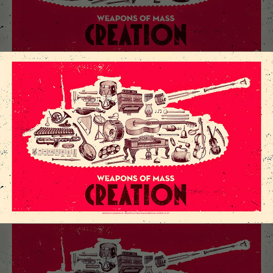
"Weapons of Mass Creation" illustrations by Justin Kamerer


This poster series by Justin Kamerer caught my eye while sourcing images.  A clever spin on the common idea of weapons of mass destruction, the illustrations are individually detailed but as a whole form a bigger picture, which reminds me a lot of Luka Lukova's dove image I wrote about yesterday.  I particularly love the little references to famous authors found in Figure 1.   The drawings of the objects are in the style of old catalogues and manuals.  Coupled with the rough outlines and contemporary font the images are a great example of a nostalgic style created digitally.

Fig 1 - Writing


Fig 2, 3 - Cooking, Art
Fig 4 -Music

Fig 5


Images

Fig 1 Kamerer, Justin. 2012.  Weapons of Mass Destruction - Writing.  Screenprint.  [online image] Available at: https://www.behance.net/gallery/4777361/Weapons-of-Mass-Creation-Writing

[Accessed 26th November 2014]

Fig 2 Kamerer, Justin. 2012.  Weapons of Mass Destruction - Cooking. Screenprint.  [online image] 
Available at: http://angryblue.bigcartel.com/product/weapons-of-mass-creation-cooking

[Accessed 26th November 2014]

Fig. 3 Kamerer, Justin. 2012.  Weapons of Mass Destruction - Art. Screenprint.  [online image]  Available at:  http://angryblue.bigcartel.com/product/weapons-of-mass-creation-art

[Accessed 26th November 2014]

Fig. 4 Kamerer, Justin. 2012.  Weapons of Mass Destruction - Music.  Screenprint.  [online image] 
Available at: http://angryblue.com/?portfolio=wmc-music 

[Accessed 26th November 2014]

Fig 5 Kamerer, Justin. 2012.  Weapons of Mass Destruction - Film.  Screenprint.  [online image] 
http://angryblue.bigcartel.com/product/weapons-of-mass-creation-film

[Accessed 26th November 2014]


Tuesday, 25 November 2014

Graphic Agitation 2 images

It's probably time I got around to writing about some of the work featured in Graphic Agitation 2, the "sequel book" to the Graphic Agitation book I wrote about a couple of weeks ago.  This book focuses more on propaganda covering contemporary issues, such as increasing concern over practices of corporate businesses or government crises from the last 25 years.  Here I picked out the ones which stood out to me most and I felt could be relevant to current research and work.

Corporal criticisms 

Fig 1
These posters stood out for different reasons; the one above was a direct manipulation of the popular Absolut advertisements, where the bottle is usually shown with illustrations in lieu of a label, while the one below does the same for the Nike adverts and their telltale motivational texts.  The Nike one is particularly relevant as I recently read "No Logo" by Naomi Klein, the main bugbear of which is with Phil Knight and the Nike company.  This poster highlights the controversial sweatshop issue which Nike continue to skirt around - the appalling conditions of the sweatshops which manufacture the sportswear brand have been well documented and caused a public outcry around the time this poster was made.  The image of an oriental-looking girl running, while holding what looks like her few belongings, serves a dual purpose of mimicking the usual images of "Nike runners", and showing in a very stark way the reality of the women who work in the garment factories owned by Nike. 

Fig 2

Anti-war criticisms


Fig 3

These works, openly critical about war in various countries, stood out because of the way the visuals were twisted in ways that were visceral, and on occasion also managed to be funny (UNable's mocking of the UN's incapability in combating war issues).  The bloodbath in the image above, created in response to the Israel-Palestine conflict, needs no further elaboration; the same can be said about the "INFANTry" image in which Lippa Pearce highlights the plight of child soldiers used in combat in the middle east.  These images are hard-hitting, and rightly so given the subject matter.  War is the subject which causes the most distress among designers and the public alike, and as a consequence the visuals created have to relate to the distress.  

Fig 4, 5

These postcards (below) were created by Triage Collective during the siege of Sarajevo, which lasted for several years.  The visuals were mostly created based on culture jamming, which was a popular form of graphic protest during the time of the war.  Culture jamming involves taking pre-existing work and adding to it, for example the image of Marilyn Monroe or the bottle of Absolut vodka.  Through using visuals that were already familiar to the public both in Bosnia and in other countries, the artists presented the plight of their country in a way that was palatable.  The scale of death and violence in the country was more than had ever been known; the siege of Sarajevo claimed the lives of almost 14,000 citizens.  It was important to present the struggle in a way that people could relate to and also see some hope, through the act of creating art.


Fig 6

No Guns Please

Gun crime and war-related weaponry is a huge arena for graphic protest, and the examples I found either lampooned them or contrasted guns with imagery that was innocent in order to crank up the shock value.  The humorous image titled "Make Tea Not War" by Karmarama uses a vivid yellow colour scheme and a bizarre image of Tony Blair to capture the attention of the viewer.  Blair's face is instantly recognisable to residents of the UK, America and much of Europe, so was an effective device in emotional and connotative anchoring.  The teacup on his head not only makes him look ridiculous but makes the view of the artist clear - war is stupid.  The "tea" element is of course very British, so resonates with locals of the UK where the poster was made.  

Fig 7


In contrast, an American standpoint on the issue of gun laws is much more emotional in the way that subject matter is handled.  The posters below both feature school children as the main focus - in the US at the time of production there had been various tragic incidents where schoolchildren had lost their lives to criminal gunmen.  The call was to tighten up gun laws for fear of anyone and everyone being able to carry and use a gun - this is illustrated quite eloquently by Art Speigelman's cover for the New Yorker in 1993.  The drawing shows young children of primary school age carrying guns to school with their lunch boxes.  Without any accompanying text, Spiegelman's opinion is still clear - if gun laws are not cracked down on, the idea of anyone carrying guns could become a reality.    The poster on the left by James Victoire is titled "Fair Game in America", which says everything about its message.  
Victoire's target illustrations were a deliberate attempt to show how easy it could be for more children to become victims of gun crime.  

Fig 8,9

Fig 10

This image by Luka Lukova (Figure 10) is clever in its mixed message and needs no further elaboration in the poster.  The dove is the international symbol of peace, made up here by silhouettes of weapons, war vehicles, explosions and soldiers in combat.  Lukova's criticism of the idea that we need the military to enforce peace is clear.  This image is arguably one of the simplest but most effective as the icons could be understood by anyone in the world who is familiar with the visuals of war.

The images I chose from the book have highlighted the use of simple visuals being twisted into having a multi-layered meaning, and the sensitivity (or lack of) that certain issues have to be handled with when being conveyed through art.  The main question this has raised for me is whether people reacted more to the "softer" visuals (the Sarajevo postcards, the dove image in Figure 10) as they were easier to digest, or whether they were shocked into paying attention by the visceral nature of images like the Nike one in Figure 1.  In a society where war is so frequent that we have arguably become a little de-sensitised, do people need to be jolted back into an awareness or do they need to be re-introduced to it in a more gentle way?

References

McQuinston, Liz. 2004.  Graphic Agitation 2.  London: Phaidon Press

Images - all scanned from Graphic Agitation 2

Fig. 2 Abusters Magazine. 2001.  Subvertising

Fig. 10 lukova, Luka. 2001. No title.

Fig. 4  Pearce, Lippa and Miller, Erik.  2001.  Infantry

Fig. 5 Lemel, Yossi. 1995. UNable

Fig. 6 Trio design group, 1993-1994.  Sarajevo postcards

Fig. 3 Lemel, Yossi. 2002. Bloodbath

Fig. 1 Maivyane-Davis, Chaz. 2000.  30 Days of Activism

Fig. 7 Karmarama, 2003.  Make Tea Not War

Fig. 8  Victore, James. 1999.  Fair Game in America

Fig. 9 Speigelman, Art. 1993.  New Yorker cover 


Monday, 24 November 2014

"A World to Win: Posters of Protest and Revolution - Exhibition at the McManus Gallery"

Today I went to see a World To Win: Posters of Protest and Revolution, an exhibition at the McManus Galleries of propaganda posters with works ranging from the early 20th century to the present crises.  The posters were diverse in their content and style which meant that I had a bit to write about.

Fig. 1 Wall photo from Culturescoop website - not from McManus!
  This wall section above (layed out in the same way at the McManus as it is in the picture above) showed posters with the theme of environmentalism and opposition to war.  The red "Stop the Burning Poster" at the far left is by the Body Shop, whose ethical values saw them oppose the mass deforestation in rain forests.  The red background was a deliberate choice by the designers in order to be a shock on the eye and not get lost in the sea of visuals in the visual culture of the time.  Language aside, "Fuck the Draft" stood out for the bold image of a man nonchalantly burning his papers summoning him to serve in the Vietnam war in the 1960s.  The combination of text and image meant that this message could never be perceived in any other way than the obvious.
"Against Apartheid - Boycott South African Goods" is a clever use of contrast and negative space, which served the additional purpose of literally illustrating the issue addressed in the poster.  The poster was created during the struggles of apartheid in South Africa, urging people to boycott exported products from the country.  All of these examples are interesting as they require a little bit of visual rhetoric and cultural understanding of the events behind the posters.

Fig. 2 Wall photo from Culturescoop website
  This section, named "Subvertising", focused on anti-corporate propaganda, which ties in with my recent read of "No Logo" by Naomi Klein.  Many global brands have been exposed as being corrupt in business and/or ethical practices, for example McDonalds taking over chain restaurants in Britain under a capitalist government (top left) and Schweppes swapping their glass bottles for non-recyclable plastics.   These posters urge both the public and designers to reject these businesses whose practices are not in the best interests of the public.  

Other posters in the section above noted below: 

Fig 3 Save The Arctic Stop Shell by Christian Uhlenfelt
Artist Christian Uhlenfelt made a dual visual statement in "Save the Arctic Stop Shell" montage above, manipulating Shell's logo into a caricature of a polar bear (native to the arctic) and contrasting it with a photograph of a terrain that appears to be icy/rocky and soaked in oil on one half.

Fig 4 Sun Mad by Esther Hernandez
Mahlke's "Sun Mad" directly subverts the packaging visuals of SunMaid raisins in an attempt to expose    the company's practices in growing their produce.  This piece is interesting to my research as it could be seen as the "white propaganda" to the original packaging's "black propaganda."  The visuals are a balance between the traditional and familiar subject matte and that which is more jarring (aka the skeleton).  A similar example of blending familiar brand visuals with an anti-corporation message is "Germany - is it?" by Peter Poch.  The poster was created at a time where many European countries were seemingly becoming "Americanised" in their consumer culture.  Poch's visual statement on this is both sarcastic and disapproving of the increasing saturation of US brands in German culture, using the trademark looping font and red and white colour scheme of Coca-Cola.

Fig 5 Germany, is it? by Peter Pocs

Colour schemes and iconography

Fig 6 Victory of the Five Year Plan by N.V Tsivchinskii
Fig 7. 1905 The Path to October by Valentina Kulagina
Fig 8 Workers, Citizens, Farmers, Soldiers; All The People of Germany by Cesar Klein

Fig 9 The Tenth Anniversary of the Triumph of the Cuban Rebellion by Rene Mederos

Fig 10 So Long as Women are not Free the People Are Not Free by Red Woman's Workshop

Visual features which suggest strength and movement were a prominent theme across the exhibition.  In particular the image of raised fists is used to suggest a power or forcefulness against a system that has oppressed a particular group of people.  Above examples are the poster titled "So Long as Women Are Not Free the People Are Not Free" showing women shouting and punching the air; in a more celebratory mood are the men shown holding their guns in the air in celebration of their successful rebellion.  In "Victory of the Five Year Plan", a huge red fist representing the Soviets crushes a stone no.5 onto anti-communist enemies.  The colour red is widely used in conjunction with Soviet propaganda to represent the communists in visuals.


Fig 11 "And babies" by Ronald L. Haeberie
Fig 12 Que Fais-Tu Pour Empecher Cela? by the Ministerio de Propaganda, Spain


Fig 13 23.10.56 by Peter Pocs

War awareness and anti-war posters tended to be the hardest-hitting in terms of visuals, as deaths of civilians and soldiers alike is a matter that is always pressing.  One of the most famous, or infamous depending on how it is viewed, is the poster by war photographer "And babies"  The picture shows the corpses of children killed in the My Lai massacre of 1968, where over 500 civilians were killed by soldiers in Vietnam.  The quotes "Q: And babies? A: And babies." is from an interview where it was confirmed that children's lives were not spared in the killings.  The question "And babies?" is a rhetorical continuation of the common phrase of "men and women" being victims, adding an additional layer of horror to the shock value.  Similarly, the red star made out of bloody flesh in Peter Pocs' 23.10 '56 represents the national revolt against the Hungarian People's Republic.   The mouse trap in which the star is caught is intended to be a representation of the government, who violently cracked down on the rebellions. 


Fig 14 Protest by Red Woman's Workshop
"Protest" by Red Woman's Workshop encourages women to start "speaking out;" the figures spilling from the woman's mouth depict the "traditional" roles of women in Latina society - to get married, to be objectified.  The poster is urging women to go against these "rules" of society.


Fig 15 There's A Credit Crunch, Not A Creative Crunch by Aida Wild, 2011
 Some posters which took the approach of encouraging creativity in propaganda also caught my eye, as this was a little different to the protest-based nature of others.  The one above serves to remind artists and designers that lack of resources in money does not mean the same for production of art.  Another one which I have not been able to find online is a poster which read "Got something to say? Screenprint It!", which was from the seventies (I think).  This poster was particularly relevant as I recently took a screen printing workshop, after reading about the style's significance as a contemporary form of visual persuasion.

Overall the exhibition was useful for me to look at as a "refresher" of visuals.  Having spent the last 2 weeks mostly buried in research I am getting back into practical work and the work featured here was full of inspiring references for visuals and information.

-

References

Fig 1: From the Culturescoop website [online image] Available at: http://www.culturescoop.com/2014/09/

Fig 2: From the Culturescoop website [online image] Available at: http://www.culturescoop.com/2014/09/

Fig 3: Uhnfelt, Christian, date unknown.  Save The Arctic Stop Shell [online image] Available at:
http://fold7.com/blog/play/posters-protest-revolution

Fig 4: Hernandez, Esther, 1982.  Sun Maid.  Screenprint 26 x 20 [online image] Available at:
http://artinprint.org/index.php/articles/article/ester_hernandez_sun_mad

Fig 5: Peter Poch. 1990. Deutschland, Is It?  Screenprint [online image] Available at:
http://collections.vam.ac.uk/item/O185861/deutschland-is-it-pro-democracy-poster-mahlke/

Fig 6:  Tvischinskii, N.V, 1931. Victory of the Five Year Plan.  Lithographic Print [online image] Available at:
http://www.lib.uchicago.edu/e/about/press/sovietposters.html

Fig 7:  Kuligina, Valentina.  1929.  1905:  The Road to October.  Lithographic [online image] Available at: http://library.brown.edu/cds/Views_and_Reviews/item_views/medium_itemlevel_posters.php?id=86&view_type=medium_index

Fig 8:  Klein, Cesar. 1918.  Workers Citizens Farmers Soldiers.  Colour lithograph [online image] Available at:  http://collections.vam.ac.uk/item/O100784/workers-citizens-farmers-soldiers-all-poster-klein-cesar/

Fig 9:  Mederos, Rene, 1969.  The Tenth Anniversary of the Triumph of the Cuban Revolution [online image] Available at:  http://digitalpostercollection.com/propaganda/1945-1991-cold-war/cuba/1959-1969-tenth-anniversary-of-the-triumph-of-the-cuban-rebellion-by-rene-mederos/

Fig 10:  Red Woman's Workshop, date unknown.  So Long As The Women Are Not Free The People Are Not Free [online image] Available at:
http://seeredwomensworkshop.wordpress.com/#jp-carousel-15

Fig 11:  Haeberie, Ronald, 1969.  And Babies.  Colour photograph [online image] Available at:
http://en.wikipedia.org/wiki/And_babies#mediaviewer/File:And_Babies.jpg

Fig 12:  Ministerio de Propaganda, 1937.  Lithograph print [online image] Available at:
http://www.moma.org/collection/object.php?object_id=159593

Fig 13:  Pocs, Pocs, 1981. 23.10.56.  [online image] Available at:

Fig 14: Red Woman's Workshop, date unknown.  Protest [online image] Available at:
http://seeredwomensworkshop.wordpress.com/#jp-carousel-17
[Accessed 24th November]

Fig 15: Wild, Aida. 2011.  There's A Credit Crunch, Not A Creative Crunch.  Screenprint [online image] Available at:  http://www.vam.ac.uk/blog/va-shop/credit-crunch