I have been making some changes in my work in the last couple of weeks, most notably the header typeface and some of the illustrations. You will notice that the ribbon look I was so keen on has been changed for a less frilly Futura in all caps, which I felt worked better with the layout. It is a bold heading, but the letterforms are slim enough to not be overstated, and the sharp angles are in keeping with the crisper outlines of the vector illustrations. I deliberately chose a sans serif for the heading, to keep a good contrast with the serif body text.
 |
| Fig 1 |
After reading up on some elements of Gestalt theory, it emerged that the use of a bounding box is often very helpful in regard to the rule of figure-ground composition, which is an important one in the application of Gestalt Principles to scree design. The image above looks un-coordiated - there is a focal point from the illustration, but the text seems to be just "floating" on the page. As a result, the eye may have to work harder initially to process the forms of the short paragraphs. To solve this, I edited the copy to fit into two boxes and used those to create a strong figure-ground contrast, as well as using the law of similarity to identify text elements as linked to each other (below). Already it looks a lot more tied together, and because the elements are a little bit closer together, the page layout as a whole is more compact and easier to take in. The law of proximity also comes into play here, as it follows that placing objects close to one another signifies their relationship.
 |
| Fig 2 |
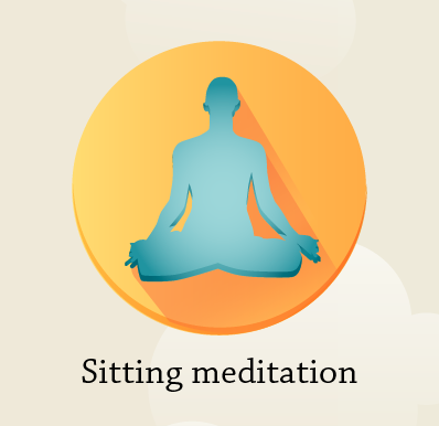
You will also notice that I have replaced the illustration of the face with a slightly different one. This is because, when I laid the face illustration in Fig 1 out next to other anatomical ones, it stood out as being inconsistent in style. I adapted the face to be more angular and clean, and found that it fit into the visual style much more easily. I added a little body at the bottom so that I could also use it for the body scan exercises and adapt it for the meditation exercises, because I realised that the illustrations for those did not really fit either (Fig 3). While to me they were quite clear in what they were communicating, I felt that they lacked in detail so were a bit of a sore thumb compared to the anatomical illustrations because of this. I had toyed with the idea of having a little character for a while too, so substituting silhouette figures for something with more personality made that possible.
Fig 3
 |
| Fig 4 |
I have been experimenting with how to present the body text with keywords in it to help highlight specific information in the user's mind. As you can see below, I had to have some misses before I hit on a colour of font that made enough contrast with the dark background. The bounding box for the text is at 80% greyscale, so very quickly I realised that the text should be in 5% greyscale with the blue highlights a bit lighter than they are shown here.
 |
| Fig 5 |
After some more playing about I tried out italics for the highlighted words. Since it is used in print for emphasis, I realised it would suit the nature of the "key words" idea I am going for here. I think I will keep them - they are not as chunky as the bold option, so they don't interrupt the flow of reading. The bold text does work for emphasis, but the change in the letterforms themselves doesn't lend itself to smooth reading. Italic lettering at least keeps the same stem widths etc.
This page also shows back/forward buttons as well as the accordion menu. I am not sure if I will keep both the back button and the accordion menu as there isn't the room for both of them in the top left corner, which is where they are both expected to be. I expect I will have people using the breadcrumbs to navigate too and get some feedback on how well that works. I am not aware of InvisionApp facilitating gestures, which is a shame because having a swipe right gesture would solve the back button problem!
 |
| Fig 6 |
This is a draft homepage. Not sure if I am going to keep it like this, but it sets the navigation up for exploring the main points of mindfulness.
 |
| Fig 7 |


No comments:
Post a Comment