Previously I posted a logo and identity for a brand I made up - ITech. I decided to create a mock-up of the app/website that the service would run through.
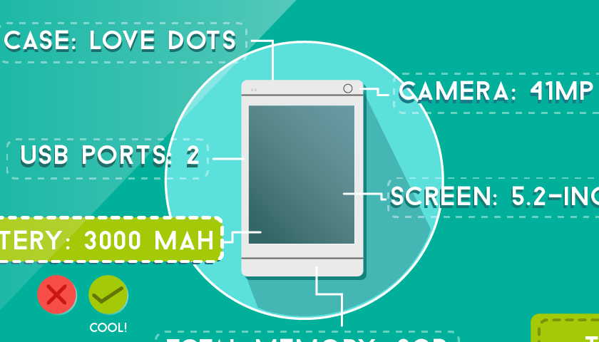
I wanted the UI of the app to follow the personal element I had brought in to the logo, with the stitched lines and the cog emblem. I used a quirky, high saturation colour scheme to be bright and appealing, and the palette is fairly gender neutral. Vector designs allowed me to create layouts that I could give a little bit of depth to through choosing colours with lower hues and brightness levels to create the impression of shadows. This stopped it from looking too flat but saved me from overcomplicating with gradients as I am wont to do a lot.
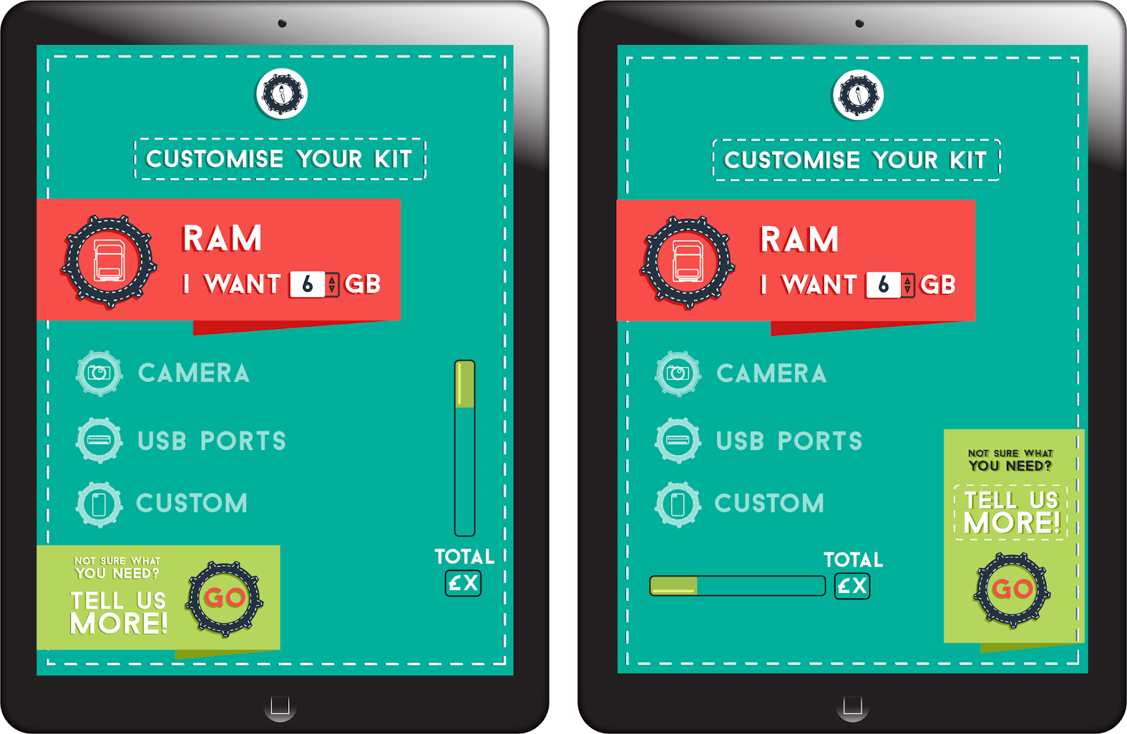 |
| Spec menu options |
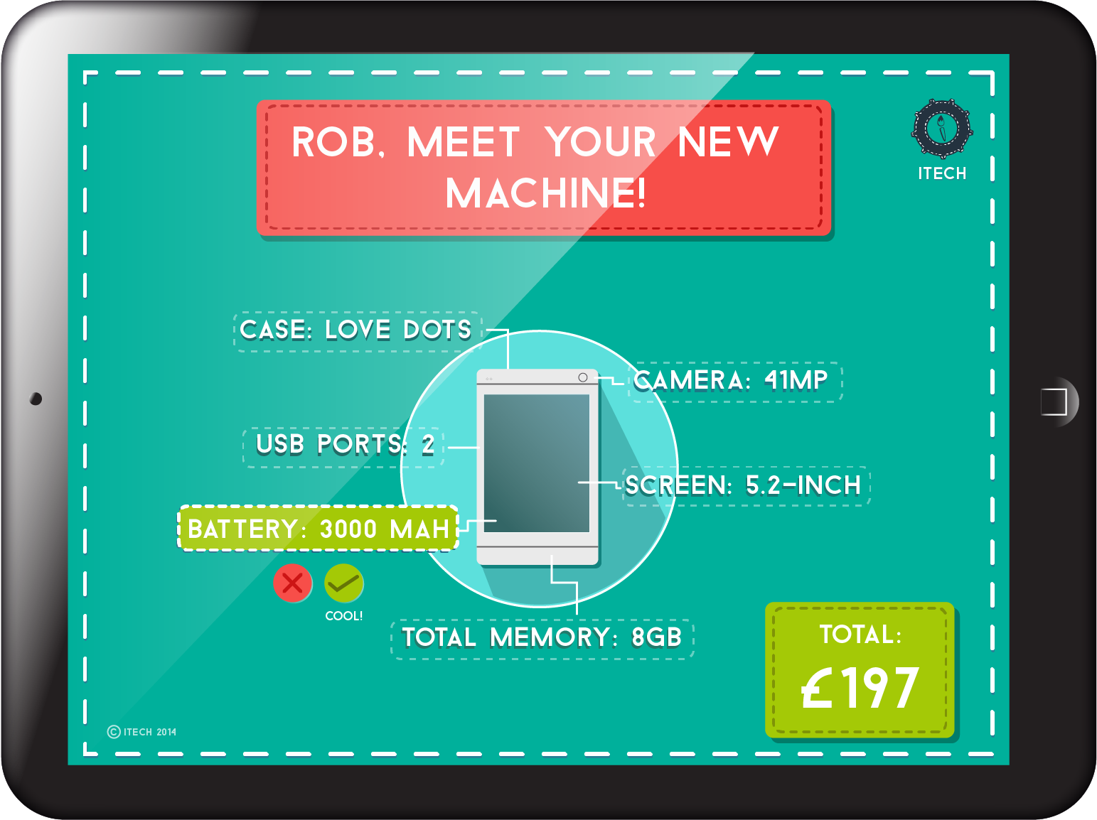 |
| Final spec screen for customers |
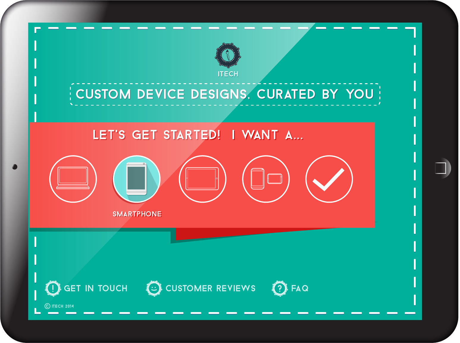 |
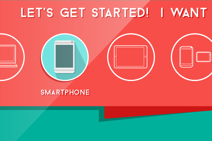
| Secondary screen, the beginning of the process |
 |
| Detail |
 |
| Details - the end details can be changed or "ok'-ed by the user |
My aim for this mini-project was to create an identity for a brand which I think I have done to an extent, given the materials produced in the time frame I gave myself for this one. This could be animated into a short fake interactive video or even a gif, which ties in with other areas of research I am looking at at the moment.
This article is a great article that I have seen in my blog career so far, it helps me a lot in my blogging career
ReplyDeletehire python developers in US