Andrew Park
Park is an information designer by trade, and is mostly commissioned by corporate businesses to present their data to the public. His work is sleek and centres mostly around numerical data, so relative size diagrams and line graphs are common throughout his work.
 |
| Fig 1 |
This diagram of worldwide holiday costs chart for the Post Office uses the size of its circles to show relativity between figures from each country. David McCandless talks about finding relationships between data, and this is a good example as the size of each circle is directly related to the value within it.
 |
| Fig 2 |
This piece below contains information that is a bit on the boring side, which is why Parks was hired to translate the yearly report into something less dry. Employees of Investec and customers alike can see how many people are in paid employment, part time or looking for a job, year on year. No, it doesn't make the subject matter more glamourous, but it clearly shows how employment figures have been over the span of 2012-2013.
 |
| Fig 3 |
Ahead App
 |
| Fig 4 |
The isometric view and rollover feature makes a bar graph much more interesting.
Brockhaus Encyclopedia Infographics/Steelcase 360 Magazine by Bureau Oberhauser
While these are designed for print rather than web, the way the illustrations are merged into part of the data is interesting (see below). |
| Fig 5 |
 |
| Fig 6 |
 |
| Fig 7 |
Selected info graphics from David McCandless' Information is Beautiful blog
 |
| Fig 8 |
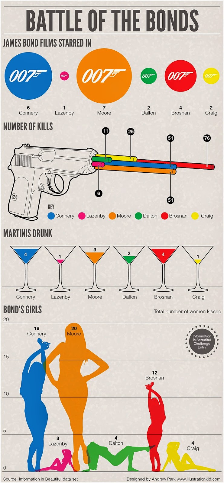
This is a fab Bond-themed info graphic which uses icons from the films to present the data related to each of the Bond actors. Not only does it showcase the information clearly but it hits on a note of recognition for Bond fans and is recognisable to anyone familiar with the films. It's easy to pick out the information relating to each character due to each having a colour assigned.
 |
| Fig 9 |
David McCandless' "Who Rules The Social Web" is a fun look at which websites each gender has a higher usage of across the board. The proportional bar graphs directly represent the subject matter, in that McCandless uses the universal pictograms for male and female as the symbols to represent figures. What is interesting (but probably not surprising!) is that women are much more avid users of social media which revolves around conversation, photos and generally sites that are for "journalling" life and sharing what they are up to. Men, on the other hand, use sites that centre around conversation with others and sharing work.
A different take on the subject of gender is the work below about rape statistics and the small percentage of women who speak out compared to instances of rape. The size of the circles are directly related to the number in the circle, which is a sobering fact when we note the differences in size between the estimated number of rapes and the number of rapists convicted.
Extra information is placed at either side of the central data in a muted grey, which means that the piece presents all the essential facts but is not too busy on the eyes.
 |
| Fig 10 |
References
Fig 1 Park, Andrew. 2014. Information design project for Sticky Content Client the Post Office - Holiday Costs Barometer 2014 [online] Available at: http://www.illustrationkid.com/page2.htm
[Accessed 17th Feb 2015]Fig 2 Park, Andrew. 2014. Infographic looking at ways to boost Wi-Fi produced for Currys Tech Talk blog [online] Available at: http://www.illustrationkid.com/page2.htm
[Accessed 17th Feb 2015]
Fig 3 Park, Andrew. 2014. Employment infogrpahic for PA client Investec [online] Available at: http://www.illustrationkid.com/page2.htm
[Accessed 17th Feb 2015]
Fig 4 Faydi, Clement. 2011. Ahead App [online] Available at: https://www.behance.net/gallery/1092739/Ahead-App
[Accessed 17th Feb 2015]
Fig 5 Bureau Oberhauser. 2012. Brockhaus Encyclopedia [online] Available at: https://www.behance.net/gallery/2726303/Brockhaus-Encyclopedia-Infographics
[Accessed 17th Feb 2015]
Fig 6 Bureau Oberhauser. 2012. Brockhaus Encyclopedia [online] Available at: https://www.behance.net/gallery/2726303/Brockhaus-Encyclopedia-Infographics
[Accessed 17th Feb 2015]
Fig 7 Bureau Oberhauser. 2012. Brockhaus Encyclopedia [online] Available at: https://www.behance.net/gallery/2726303/Brockhaus-Encyclopedia-Infographics
[Accessed 17th Feb 2015]Fig 8 Unknown
Fig 9 McCandless, David. 2014. Who Rules The Social Web? [online] Available at: http://www.informationisbeautiful.net/2014/who-rules-the-social-web-2/
[Accessed 17th Feb 2015]
Fig 10 McCandless, David. 2012. Rape: A Lack of Conviction [online] Available at:
http://www.informationisbeautiful.net/visualizations/rape-a-lack-of-conviction/
[Accessed 17th Feb 2015]
No comments:
Post a Comment