Sunday, 23 November 2014

Printmaking workshop at the DCA

I have been a bit quiet on here since last week as I have been working to finish my proposal, so since which is handed in now I have time to write about a class I attended last Saturday at the DCA studio.  The workshop was called "Andy Warhol Workshop" and was essentially a crash-course in screen printing.  I decided to attend as a lot of the work I have been writing about on this blog was created by screen printing - Shepard Fairey, Shigeo Fukuda and many others have used this method in their work. Going along to the class allowed me to try a new technique and conveniently make some media tests for the pre-production module.

To start the process, the class leader Claire took our images we had brought in and scanned them so that we could tape them under the printer press as a reference.  Mine was this one (below, post-paint stains) which I took from a Toni & Guy ad (intense proposal research and extra-curricular responsibilities meant I didn't have adequate time to prepare my own image).

Fig.1 Original scan

Using these images, we then painted out on the screen press the areas we wanted to stay white, in order to block in the background colour.  The paint we used had a name I cannot remember, but it essentially blocked any paint from getting through onto the paper.  After we were satisfied with what we had painted in, we used cellophane to do a test print, and used masking tape to mark the position on the paper we wanted to print.  Below was my first "layer", drying on the rack.

Fig. 2 First layer of print

We continued this process, blocking in each layer we wanted to keep the previous colour (e.g the face was blocked out in order to keep it pink when the yellow layer was applied in Figure 3).   The layers eventually built up to the image on the screen in Figure 4.

Fig. 3 Second layer of yellow.  I kept this one as is.

Fig. 4 Blocked out layers on the nylon screen.


In the meantime, in between helping us, Claire had taken our original images and exposed them to a UV light to bring out the negative image.  These were used to add the final black layer to the images, which was printed on last and really brought the image together.  I wasn't able to get a photo of my own image so another guy kindly let me take a photo of his.

Fig. 5 Nkem's black layer print on cellophane

Fig. 6 Prints by others drying on the rack

Due to some rookie errors, my images came out a little bit misaligned in some places, but the end effect was a very retro-grunge one which surprised me.  I had ideally wanted something quite neat, but everyone agreed my mishaps had produced work that had a nice bit of dynamism to it.

  In my digital work I have been playing around with recreating printing aesthetics from Warhol's era, as Illustrator allows for the creation of halftones and stereoscopics in digital format.  I thought the results here were a nice, if accidental, little nod to that.   In addition to that, the screen prints related to a lot of my research for my proposal on a device of visual persuasion called "familiarisation".  Familiarisation is used to great effect by Shepard Fairey, Bruce Emmet and Charles S. Anderson, among others.  It is centred around recreating techniques and visual styles in their work, such as screen printing, which deliberately references work from artists in eras such as the 1960s (notably Robert Raushcenberg and Warhol, whom this class was based on) which we know as a culture to be associated with political action.  I was really interested in this idea as it could potentially play a big part in answering my research question for my dissertation.  The prints created in this workshop can at least be a starting point in this area.

 Below:  some of my end prints.

Fig. 7 This one came out wonky but I quite like the effect


Fig. 8  Not entirely sure how the yellow managed to line up so badly, but it gives the picture more depth!

Fig. 9 Image with all layers, blue background.  

Fig. 10 Print with all layers, purple background.


Creating work physically was something I realised I had missed so I hope to try this again.  I'm not sure if I will have time before deadlines so I'm pleased that I at least got to experiment with the screen printing techniques.  I hope to try creating holographs next too.


Wednesday, 12 November 2014

"Choose Your Fruit Wisely" - visuals for an idea instead of a product


Back a while ago (6 weeks, whoops), I had a chat with my lecturer Dave about my project.  He was really keen to have me to something which did not involve branding a new product, as this is something that has been done many times before and to him has lost it's charm.  Something he suggested was branding a philosophy, which I admit I was not to keen on and have yet to really get into.   Something I have been working on here and there is an idea I came up with quite unexpectedly, based on twisting the nutrition information of certain fruits (bear with me).   After my recent posts on visual identities of movements and certain persuasion groups I thought it was a good time to introduce it as I am working on it.  

My Home Economics teacher from high school used to always warn her students about the dangers of eating too much of a certain kind of fruit.  When cooking with lemon juice we were told of the dangers it would cause to eroding tooth enamel and the irritation it could cause our stomachs, and she sometimes liked to joke that apples were "poison apples" due to the trace amounts of cyanide which are found in the seeds.  Since fruit is touted as being part of a healthy everyday diet, I thought it might be a novel way to properly get started at doing practical work related to my recent research (see my recent post on visual styles in propaganda, also the pro-sugar posters) by creating a series of posters which exaggerated the nutritious content of particular fruits.

  During our time in the drawing studio last week I took the opportunity to sketch out some ideas on paper.  They look a bit David Shrigley-like before given the digital treatment.

Fig.1  - A3 paper with sketches
Issues such as cyanide levels, sugar content and the amount of citric acid in fruits were presented as an issue for concern.    Lemons were a good one to start with, as they are high in citric acid and can often cause irritation to teeth and stomach.  The imagery associated with corrosive materials (Fig. 2) exaggerated this fact and made it look like a bit of a health hazard.  

Fig. 2 - Sketch on paper
Here is a peek at one of the many digital poster versions:


Enamel Erosion experiment - linking to my recent post about styles used in persuasive art, I am playing about with a few different graphic styles for each poster.


This is an ongoing work which I am currently juggling with my research proposal; I hope that the finished versions will be up soon.


Food for thought - Black Poppies against militarism

Today I read this article, published yesterday on Vice, about the 16000 posters of black poppies being put up in Glasgow as a response to the red poppy appeal.  It's worth writing a little bit about, as so much of my research recently has been tied up in visual culture and connotations, and political symbols.  

  The "Red Poppy Appeal" has come to be a tradition in the United Kingdom, where in the month of November people are encouraged to wear a poppy on their lapels to mark remembrance for the lives lost in the first and second World Wars.  Respect for the dead is a huge deal in this country, and it is impossible to turn on the TV during the month of November without seeing a presenter wearing a poppy.  So it has outraged a few people that a group of activists in Glasgow chose to put up posters of a black poppy, with the website URL "www.resistmilitarism.com"; a clear affront to what is considered a national pastime of mourning those lost in what we tend to glorify as honourable combat.  At a time where we are decorating a national monument with one ceramic poppy for every death in World War One, any reaction against the poppy is seen as anti-patriotic and disrespectful.

  War is unwanted, unneccesary, and the cry from the public on both sides of the Atlantic to withdraw troops from war zones such as Iraq and Afghanistan has finally been acted on.   So why, when a group of people subvert the symbol for war remembrance, is there such disgust?  For me, it's as much about the symbol of the poppy itself as what it represents.  We know the poppy is red, we can identify it instantly and describe it to someone else with ease.  Most importantly, the red poppy is the "brand" by which we identify the idea of armistice, and the message of "Lest We Forget", which for a country such as ours which has a history so tied up in warfare is a nod to the past and a warning to the future.  To the British public, the idea of a black poppy is morbid and unfamiliar.  It appears to be a twisted take on what is perceived as an honoured tradition.

Interestingly, those driving the campaign for de-militarisation disagree. The 16000 posters, they say, represent the number of men who refused to be drafted and were consequently assigned the white feather - another symbol, to mark them out as cowards.  The aptly White Feather Collective, the "movement" behind the posters, believe these men to be the true "honoraries" of the time and claim that "the red poppy has, for want of a better word, been fetishised." (Murphy, interviewed by Turbett, 2014).

"It was an action to provide an alternative message of remembrance to the way the red poppy is used, which now symbolises a permanent war industry.  It shows up how one moment our leaders are teary eyed at the Cenotaph and selling weapons in the global arms economy the next." says Zara Murphy, who is a part of the Collective.  While the movement does not wish to change the tradition of remembering the war and the deaths that occurred because of it,  it does aim to point out that "we are being told how to remember and it's a very narrow frame." (Murphy, interviewed by Turbett, 2014)  Murphy argues further that the red poppy is used to glorify war, referencing statues and ceremonies which honoured those in combat for dying in the name of a service that promotes death and violence.  "…we hope to re-politicise the poppy to what it was actually meant to stand for: to remember the futility and horror of war, and all the people who have lost their lives to war, and who continue to suffer today due to war." (Murphy, interviewed by Turbett, 2014)

Looking at the matter from an angle of persuasion, it could be argued that the red poppy symbol represents the element of glory that is wrapped up in combat; the connotation of being proud to serve your country is used to gloss over any death and devastation which a British-led war undoubtedly also causes the other side.   Many British people take pride in their ancestors having fought for British freedom in the war, and emotionally this is what the red poppy currently represents.  Murphy and the rest of White Feather Collective want to change this.  "Right now, the way the symbol of the poppy is being used is that the dead are being exploited.  They're being used as tools - just the way there were when they were soldiers - to bolster this idea of "the nation" and excuse more destructive violence in the future.  That's exactly the opposite of what the remembrance poppy should be about." (Murphy, interviewed by Turbett, 2014).

Here, both the red and black poppies have been shown as an identity of something bigger and the ideas they represent.  Both continue to be used as devices to continue a line of thinking, and in the case of the black poppy, to persuade the public to question what the brand that is the Poppy Appeal really represents.

References:

Turbett, Liam, 2014. Vice UK. "Glasgow Has Been Plastered in Thousands of Black Poppies" [online article] Available at: http://www.vice.com/read/black-poppies-in-glasgow-710


Monday, 10 November 2014

The importance of brand communities and participatory culture


 One of my last posts looked at anti-branding and the communities that form on the Internet because of them.  This got me thinking about the community aspect of regular brands, and how this could be used to push the reach of a brand further.  Many brands produce products that could sell as is, but are further heightened to a kind of cult fashion or communal status.  This is based on an identity that the collective consumers take on and can see in each other.  I don't know exactly how this will fit in with my own work in a practical sense but for research, finding why brands have such followings as they do is valuable.

"Brand community" is the term social scientists use to describe like-minded consumers who identify with a particular brand and share significant traits.."(Kalman, 2009)  The community aspect of a brand is very often the key to it's popularity and ongoing business success.

Often a brand's heritage is key to maintaining and driving a community.  Doc Martens, for example, is a brand which centres around it's footwear line, whose inherent punk roots very often speak for the interests of the person wearing them.  The shoes were known as utility wear favoured by postmen and policemen, until Pete Townsend of The Who began to wear them in 1966 and they became associated with the music scene.  In the 1980s the brand became associated with racial violence when they became popular with skinheads who made up a chunk of their market.  The 1990s saw this shift to the grunge subculture, with Kurt Cobain becoming an accidental poster boy when his body was identified by a crime scene investigator by the name he wrote on the soles of his Doc Marten shoes.

So as we can tell, fashion is a key area in which brand communities form, as the recognition is instant based on what a person is wearing.  Brand communities very often form around brands that tie in with a particular sport.  Notable examples which have come up in books I have read recently are Burton, for snowboarding, Maui and Sons, for surfing, and Harley Davidson, for motorbiking.    All have a fan base who can identify each others' interests from what they are wearing or riding.  Boarders who wear Burton will gauge that their fellow brand-mates have the same tastes in quality gear that they do, and identify on some level the same values that Burton hold about the snowboard lifestyle.  To quote Kalman (2009) "..the Harley-Davidson brand stands for freedom, individuality, and rebelliousness.  So it's no surprise that these qualities are reflected in the typical leather-jacketed Harley-Davidson motorcycle rider."  On Maui and Sons' instagram account, phrases such as "part of the family" are thrown around, and the admin staff of the account reply directly to enquiries made by it's followers.  The identity that ties in with the surfing culture is clear, and as a result the brand is integrated with the surfing community particularly in North America.  As Kalman writes, '…consumers in an identifiable brand community represent a cohesive group that reflect's the brand's values."

Fig Maui and Sons Screenshot from my computer

The Maui and sons Instagram account shows posts from surfers.  The vibe of the imagery is telling in the brand's laid-back attitude and love of the sea, which also goes for those who wear it. 


An extension of this "embodiment" attitude is also referenced by Kalman (2009) who writes "What the research does not reveal so well is the degree to which consumers may aspire to (or adopt) a brand's ideals even if they don't embody them initially…a button-down businessman may live vicariously through the Harley-Davidson brand.  This is important to note because current and prospective brand community members embrace the brand identity in graduations from the noncommittal to the true brand enthusiast." 


The above campaign by Esprit was featured in the Graphic Agitation book I wrote about last week. The series of advertisements shows different women who can all identify as being an "Esprit girl" - a down-to earth woman with ethical values who wants to drive social change in the world.  The photos are not pretentious, the typeface is not refined; Esprit was at this time a brand rooted in every day wear rather than high fashion.  This made me consider another snippet from Kalman (2009): "Brand communities have proven to be a powerful force. which leaves brand marketers with an imperative to cultivate relationships with members and to channel the consumers' passions in directions that are helpful to the brand."  By choosing messages that inspire optimism for society, Esprit marked itself as more than a clothing brand - it was a brand with a conscience.

 Today, the company's approach still centres around their model of having "faces" of the brand, perhaps in a way that looks more high-fashion and glamourous but still considers women of all ages who have forged their own path.  The women all work creative jobs but have enough range in background and character to inspire and identify with many different kinds of women.   Esprit invite their customers/fans to write "Thank you" stories to important people in their lives, thus contributing to the brand's presence and campaigns.  Maui and Sons did a similar stint in 2013, inviting their customers and fans to re-design the iconic Maui and Sons Cookie with rewards such as cash prizes, an interview with the art director and of course their work being displayed on the post-submission gallery.  This is just one example of many who have used customer engagement to great effect.  "To unlock the full potential of brand communities, marketers much consider ways to add value to the consumer experience, earning the consumer's attention outside the context of the purchase or use of the brand." (Kalman, 2009)

Fig. 6 - Screen shot from Esprit website - call to say "Thank you"

Fig. 7  - Screen shot from Esprit website - the brand's "Muses"
Many brands are picking up on this fan input system as a way of extending their reach and the community of the brand.  "As visible consumers of a brand, brand community members can become its best promoters: Brand community members propel the brand message (and their enthusiasm for it) into the market and also act as the conduit for feedback from the market….brand communities can become the source of valuable customer research." (Kalman, 2009) The women shown above were all chosen because they bought Esprit and had already associated with the brand community.

In a report from MIT press, Jenkins, Clinton et al (2009) define participatory culture as "a culture with relatively low barriers to artistic expression and civic engagement, strong support for creating and sharing creations, and some type of informal mentorship whereby experienced participants pass along knowledge to novices.  In participatory culture, members also believe their contributions matter and feel some degree of social connection with one another (at the least, members care about others' opinions of what they have created)."  A prime example of this is the system at Adobe, where there is a high online community of tutorials, forums and a gallery of work, all of which is open to anyone with an Adobe account.  "Adobe knows that engaged customers are a company's best assets.  You can't compete successfully in the marketplace only by creating a better product or holding down costs.  Quality products and competitive pricing are required just to stay in business, but customer engagement provides a long term competitive advantage.  Without engagement, you can't expect to build a successful company or organisation." (Wolfe, 2012).  An Adobe customer expects high quality customer service and receives so, through Adobe itself and other members of the community who help to make it grow.  
Another recent example of a participatory culture in a brand is that of Lidl, who invited their customers to curate their current campaign through Facebook post in, tweeting and instagramming their meals made from Lidl's produce.  A German supermarket chain is an unlikely place to see any sort of brand community but the campaign, a clever wordplay of #LidlSurprises, has proved a success.  Through using social media and putting their customers in the role of the advertising designer, Lidl have found a new avenue to show off that they do in fact produce quality food - something of a surprise to many, who assumed that Lidl prices were low to match the quality.  It links in nicely with this quote taken from Confronting The Challenges of Participatory Culture: "Participatory culture is emerging as the culture absorbs and responds to the exploration of new media technologies that make it possible for average consumers to archive, annotate, appropriate and recirculate media in powerful new ways." (Jenkins, Clinton et al, 2009)  Following on from this, the examples set by Lidl, Adobe and others say to their brand communities that anyone can contribute.  Jenkins, Clinton et al (2009) write: "Not every member must contribute, but all must believe they are free to contribute and that what they contribute will be appropriately valued." 

I could go on with many more examples of brand communities, but I hope I have examined enough to be able to take away some key things about what makes and sustains a brand community.  I'm not aiming to create a brand community or culture myself, but the knowledge of what attracts people to identify with a brand could help inform what kind of brand content would be successful in persuasion.  


References


Jenkins, Clinton et al, 2009. Confronting the Challenges of Participatory Culture: Media Education in the 21st Century.  Cambrige: MIT Press.

Kalman, David M. 2009.  Brand Communities, Marketing and Media [online publication]
http://www.terrella.com/bcmarketingwp2.pdf

Larsen, K and Zubernis, L, 2012. Fan Culture Theory/Practise [Newcastle upon Tyne: Cambridge Scholars]

Wolfe, Rob, 2012.  B2B Marketing. 5 Tales of Customer Engagement: Brands Connecting With Buyers. [online article] Available at: http://www.b2bmarketing.net/blog/posts/2012/04/13/5-tales-customer-engagement-brands-connecting-buyers
[Accessed 10 November]

Images

Fig.1 Maui and Sons Homepage [online website] Available at: mauiandsons.com
[Accessed 10 November]

Fig. 2 Maui and Sons Instagram Account.  It's almost the weekend! #mauiandsons #weekend #beach
[online image] Available at:  http://instagram.com/p/uRXKJeDQbm/?modal=true
Fig.1 Maui and Sons Homepage [online website] Available at: mauiandsons.com
[Accessed 10 November]

Fig. 3. Maui and Sons Instagram Account.  Blue boy! Favourite chew toy! #since1980 #frisbee

Fig. 4. Unknown, c1992.  Ecollection by Esprit.  Advertising print.

Fig. 5. Unknown, c1992.  Ecollection by Esprit.  Advertising print.

Fig. 6 Screen shot from Esprit website, 2014.  [online website] Available at:
http://www.esprit.com/stories?lang=en&wt_mc=dd-stories.gb.comefrom.esprit.co.uk

Fig. 7. Screen shot from Esprit website, 2014.  [online website] Available at:
http://www.esprit.com/stories?lang=en&wt_mc=dd-stories.gb.comefrom.esprit.co.uk


"The Design of Everyday Things" by Donald A. Norman, and the effect of nostalgic styles in campaigns

At the moment I am reading Debbie Milliman's Brand Thinking and Other Noble Pursuits, which reminded me to also have a look at one book she urges every designer to read - The Design of Everyday Things by Donald Norman (because I'm not going to ignore required reading from the head of Sterling Brands, after all).  I'll admit that I struggled to see a way this book relates to my work at all, so I don't have masses to write about here.  Norman's book focuses on (surprise) everyday things, such as filing cabinets, light switches and revolving doors, and contains many many examples of times when things went wrong and people assumed it was their fault.  The true fault, according to Norman, lies in bad design of objects, either in a mechanical, kinaesthetic or face-on functional way.  He urges us to not say we are "bad with technology" or "rubbish with doors", and instead recognise that things we trusted to work smoothly aren't always designed in a way that they can do so.

"The appearance of the device must provide the critical clues required for its proper operation - knowledge has to be both in the head and in the world." (Norman, 1988).  I found this to be an interesting point - if a piece of work requires people to stop, look, consider and think, the work arguably needs to look like it has a message (or in some cases, a concealed one, keeping in mind different techniques of visual persuasion).  Exactly how something looks like it has a message is subjective from person to person, but there are general styles that can be identified as suiting the kind of graphic art which is intended to jolt people into an awareness of an issue.  In a previous post I talked about the work of Shepard Fairey at ObeyGiant, but I didn't go into the actual style of his art too much.  I feel like this is a good point to do that and compare it with other styles used in the same vein of work. By doing this I can feed my findings into practical art I am working on.

"This short lesson on conceptual models points out that good design is also an act of communication between the designer and the user, except that all the communication has to come by the appearance of the device itself.  The device must explain itself." (Norman, 1988)  Again, Norman is talking about the likes of washing machines and other everyday appliances, but the idea can translate to art practises.

Fig. 1

Fig. 2
Fig. 3


The images above were created in the last 5 years, but with a style and subject matter that deliberately mimics that of posters created in the 20th century.   The halftone prints of the 70s pop art movement are reproduced digitally in Fairey's work alongside compositions that nod to the Constructivist movement, to reference the style that was used at the time for propagandic posters.  Perhaps in the same way that President Carter commissioned Andy Warhol to create his campaign poster during the 1976 US presidential election, President Obama commissioned Shepard Fairey to create the now famous Hope poster in a move to identify with the younger voters.  Fairey's style, as well as being inspired by Warhol, is a reference to the political goings-on of the 1970s where many minority groups were fighting for equality and the biggest protest of the decade was the Vietnam War.  By visually linking his own work to political protests in both art style and imagery (hand grenades and nuclear missiles, seen in Figures 1 and 2), Fairey is telling his audience that his posters are intended to provoke questions about today's political situations.
  On another level the vector halftone design also works with the subject matter, as it makes it palatable for today's audience who are sometimes over sensitive to war-related imagery.  A photographic piece of a hand holding a hand grenade with an explosion behind it might be deemed too visceral, while a Photoshop job of George Bush holding a nuclear weapon would have caused an outrage by Republicans even more so than the illustrated interpretation above.

Figure 3 shows the cover of the Global Trade Review, issued August 2010.  At the time the world was in they eye of the storm of a financial crisis (not that it's much better now), hence the topic of the cover. By presenting it in the style of a 1950s advertisement aimed at housewives,  it could be argued that GTR are de-sensitising the issue a notch by using a familiar vintage style.  For me I find the art style almost comforting which is interesting given the serious topic.

Fig. 4
Similarly, these modern posters by the American Red Cross and the people behind Earth Hour, respectively, are created in a vector style that mimics pop art and has hints of influences from Constructivism.  The image of the white hand which bears the Red Cross logo reaching to pull the hand out from the suggested rubble says everything about the appeal.  The Red Cross is a symbol which is internationally recognised, so there is no elaboration needed as to who they are or what their cause is.  Join The Earth Hour is similar in that is shows the act of "doing", in this case turning off a lightbulb.  Earth Hour is a well known event in the West, so again all that was needed was the time and instruction to the public to "Switch off your lights". Were it not for the modern typeface it could be mistaken for a poster of a different era.

Fig. 5

Fig. 6

The Occupy America movement deliberately borrowed from old propaganda, mixing it up with fresher elements such as the Bebas Neue font in Fig.  and the illustrations which are clearly digital.  An important thing to consider is that these are all examples of white propaganda, defined by Zybnek Zeman (1978) as "openly disclosing its source." 

Fig. 7

Fig. 8

Persuasive advertising, both in the 20th and 21st century, often relied on the classic wholesome image of a person or family, painted and printed in the familiar style of what we refer to as vintage advertising.  
The image was often a ploy to persuade middle class Americans (as one typical example) to support or do something.  The painterly style seen in Daddy, What did you do in the Great War was used by the artist because that was his or her working style, but today that style is arguably associated with vintage advertising related to selling products.  The same goes for the iconic U.S army recruitment poster (Figure 9 left) 

Fig. 9

Bruce Emmet's illustrations for Coca-Cola used the same style in Retro Poster Maker, an online brand project, where coke lovers could put messages on vintage coke advertisements or upload a photo and have their faces Photoshopped in.  In this case, it was to highlight the enduring nature of the Coke brand as it was part of the 125 year anniversary campaign, and to continue the visual message of coke being a family brand for everyone.  While Coca-Cola is one of the world's biggest corporate brands on a global scale, this campaign makes the company appear personable, warm and caring which are not characteristics usually associated with global corporations.  (See my post on anti-brand communities for reference). 


Fig. 10

Fig. 11

Fig. 12
Emmet was also commissioned by BPDD et Fils to create these anti-smoking posters for the French public.  Les Droits de Non-Fumers (The Rights of Non-Smokers) appear at first glance to be a vintage-styled ad for smoking, but after reading the text it is apparent that the opposite is true.  The slogan at the bottom of the posters reads "The tobacco industry kills 73000 people a year.  Continue to trust him." Ever darker, the text beside the cigarette box refers to the "saving of millions of pensions each year" caused by early deaths of smokers, which is straight up horrible.  The second poster continues the theme of black humour, with a tagline which translates "Say no to imitations! It would be a shame to catch a cancer of poor quality." The combination of cheery, glamourised imagery and harrowing sarcasm lampoons the French's national bad habit and wars of the consequences of a public ignorance towards the dangers of smoking.  This is removed from being too harsh (and therefore risk being ignored) by mimicking the styles of vintage posters which used questions or emotional statements such as "It would be a shame to…" or "Why don't you…".  Is is also important to note that these days vintage posters and artworks are romanticised a little in our minds, which again can make a heavy subject matter slightly easier to take in.


Fig. 13

Fig. 14

So here we have seen examples, in both a persuasive and brand sense, which use a nostalgic or radical style to associate the subject matter with a movement, idea or in the case of Coca-Cola, a romanticised bygone era.  What I am curious about (and I think I have written about this before) is the connotations and visual implications of a certain style of graphic art.  Since an audience would be familiar with an art style such as Fairey's, which is wrapped up in propaganda and political advertising, does this mean they are more likely to be persuaded by it based on the fact that they know it is intended to be?   Or would they be more likely to believe the likes of the pro-sugar posters in the post previous to this one, where facts are subverted and they wouldn't know an opinion was being pressed upon them?  Exploring how this kind of art is perceived and how it influences behaviour and/or opinion seems to be where my project is headed at the moment.  

-
References


Norman, Donald, 1988. The Design of Everyday Things.  London: MIT Press

Images

Fig. 1. Fairey, Frank Shepard, 2006. Hug Bombs and Drop Babies.  Available at:
http://www.aiga.org/interview-with-shepard-fairey-still-obeying-after-all-these-year/
[Accessed 10 November 2014]

Fig. 2. Fairey, Frank Shepard, 2014. Imperial Glory Offset.  24 x 36 inch Lithograph offset. Available at: http://www.obeygiant.com/prints/imperial-glory-offset
[Accessed 10 November 2014]

Fig.3. Fairey, Frank Shepard, and Yerena, Ernesto, 2013.  Immigration Reform Now! 1.  24 x 35" offset print.  Available at: http://www.obeygiant.com/prints/immigration-reform-now-2
[Accessed 10 November 2014]

Fig. 4. Unknown, 2010.  Global Trade Review July/August 2010.  Magazine cover.  London: Exporta Group.  

Fig. 5.  Unknown, 2011.  Help Japan Rise Up Appeal Poster.  [online image] Available at:
http://webdesignsurvivalist.com/inspiration/inspiration-30-modern-propaganda-posters/

Fig 6.  Unknown, 2011.  Join The Earth Hour.  [online image] Available at:
http://webdesignsurvivalist.com/inspiration/inspiration-30-modern-propaganda-posters/

Fig. 7.  Unknown, . Occupy Wall St poster.  [online image] Available at:
http://webdesignsurvivalist.com/inspiration/inspiration-30-modern-propaganda-posters/

Fig. 8.  Uknown, #OccupyAmerica [online image] Available at:
http://webdesignsurvivalist.com/inspiration/inspiration-30-modern-propaganda-posters/

Fig. 9: The War Office, 1915.  Daddy, what did you do in the great war? Poster.  The British Library.

Fig. 9 (left). Flagg, James Montgomery, c1917.  I want you for US army: nearest recruiting station.  Lithographic print.  No location.

Fig. 10.  Emmet, Bruce, 2011.  Coca Cola Poster Maker 1 [online image] Available at: 
http://bruceemmett.blogspot.co.uk/2011/07/coca-cola-125th-anniversary.html

Fig. 11. Emmet, Bruce, 2011.  Coca Cola Poster Maker 2 [online image] Available at: 
http://bruceemmett.blogspot.co.uk/2011/07/coca-cola-125th-anniversary.html

Fig. 12. Emmet, Bruce, 2011.  Coca Cola Poster Maker Welcome Page [online image] Available at: 
http://bruceemmett.blogspot.co.uk/2011/07/coca-cola-125th-anniversary.html

Fig. 13.  Emmet, Bruce, 2014.  Les Droits Des Non-Fumers.  [online image] Available at:
http://bruceemmett.blogspot.co.uk/2012/10/les-droits-des-non-fumeurs.html

Fig. 14.  Emmet, Bruce, 2014.  Les Droits Des Non-Fumers 2.  [online image] Available at:
http://bruceemmett.blogspot.co.uk/2012/10/les-droits-des-non-fumeurs.html


Visual persuasion, covert style: questionable public health posters

If you're a fan of fructose replacements and agave syrup, look away now.   Yesterday while researching, I found these rather, er, interesting interpretations of dieting advice from the mid-1960s.  These advertisements were created by Sugar Information Inc., who for starters list their P.O box at Grand Central Station which is a little suspicious in itself.  As you can see, the messages in text are worded in a way that is persuasive and clear, but by today's standards it is a little unorthodox! 


"Sugar can be the willpower you need to under eat." Sure, except that sugar causes a release of dopamine in the brain, making it addictive and causing an increase in appetite.  But that model is enjoying an ice cream, so it can't be a lie, right?  By presenting the "ruining lunch" scenario as an appetite-queller, the message is subverted into a diet-friendly one.  In reality, while an ice cream before lunch would make a person eat less at lunchtime, it would likely mean they got hungry before dinner time and snack in between meals. 


Mary is all grown up now and probably has health complications from her crap teenage diet.  But doesn't she look full of beans here!  Using images showing youthful and energetic teens who are so jazzed to be sugar-fuelled makes sucrose look like some elixir of youth.  Probably best they left out the part where a high-sugar diet causes lethargy, weight gain and bad skin, then.  What is really interesting about the messaging in this poster is the note at the bottom, addressed "To Mothers:" which reads "Exhaustion" (from all that running around Mary does, evidently) "opens the door a little wider to the bugs and ailments that are always lying in wait.  Sugar puts back energy fast - offsets exhaustion.  Synthetic sweeteners put back nothing.  Energy is the first requirement of life." The concealed little dig at the artificial sweeteners industry hints at the economical power struggle between the two at the time.   
"Energy is the first requirement of life" appeals to the emotional side of the audience and implies that a diet based on artificial sweeteners would cause a decrease in life satisfaction and wellbeing. 


Inputs of humour such as "…like a kangaroo needs a baby buggy." disarm the viewer and make them feel as though they can relate to the statement more.  A more drastic statement like "Cut out artificial sweeteners" would be too blunt, and also hint at the real aims of Sugar Information Inc., which we can probably guess is to emotionally manipulate the public into buying more sugar.  

"The spoonful of prevention" - language like this implies that by not eating sugar a person is susceptible to more diseases.  The poster also displays other uses for sugar, such as a flavouring for soup (excuse me?) and a replacement for artificial sweeteners.  By mixing some actual facts in (sugar IS better than artificial sweeteners, but only in small doses) and 18 calories per teaspoon, Sugar Information Inc makes a covert advertisement which aims to boost the sugar industry look like a public health campaign. 


The people in the posters are happy, smiling and look energetic.  Their faces are an "emotional anchor" which draw people in - in artworks people identify most with other faces.  By placing sugar as a "willpower" booster, men and women are led to believe that sugar will make them stronger emotionally as well as physically.


Altogether the images are well-crafted and multi-layered in their message.  At a time when the public were still learning to question government advertising, awareness of health issues relation to sugar were not known by the public as they are now, and tumultuous changes in politics and socialism were taking place, it is easy to see why people could be lured into thinking that sugar was a way of ensuring physical and emotional wellbeing.  The people in the posters looked happy, healthy, slim and carefree - the idealistic goal for Americans of the time.  If sugar was the key, then why not add it to their diets more?  They had no idea that the posters were a product of spin doctors working for the sugar industry, who wanted to gain the monopoly of the market over artificial sweeteners which had been popular at the time.  This is a prime example of semi-covert, or grey, propaganda, the definition of which is "ambiguous or non-disclosed" according to Zbynek Zeman (1978).   

References

Zbynek, Zeman, 1978.  Selling the War. London: Orbis Publishing

All images by the Sugar Corporation Inc, 1960s, USA


Friday, 7 November 2014

Barbara Kruger

"I work with pictures and words because they have the ability to determine what we are and what we are not." - Barbara Kruger

I was told by a lecturer to look at work by Barbara Kruger, and I later came across her work in the Graphic Agitation book.  Her work is distinctive and obtuse in its approach to the message in each piece; quite far removed from the work of Shigeo Fukuda which I spoke about in my previous post.
Kruger's aesthetic is  always recognisable as her own - black and white photographs overlaid with slogans in outlined in angry red boxes.  Her work is often associated with feminism and combatting rape culture, consumerism and stereotypes of gender.  The combination of bold images with heavy text (Futura Bold Oblique, or Helvetica Ultra Condensed) means her work appears a confrontation against certain ideas of society. In an interview she was quoted as saying: "Pictures and words seem to become the rallying point for certain assumptions.  There are assumptions of truth and falsity and I guess the narratives of falsity are called fictions.  I replicate certain words and watch them stray form or coincide with the notions of fact and fiction."

Kruger's work centres around the practise of appropriation art, previously used by pop artists and surrealists.  Appropriation art uses images that already exist, in Kruger's case vintage prints, pretty much as they are with no change to the image itself.  Instead extra elements are brought in and added to the art - Kruger uses text for this.  Perhaps the most famous example of appropriation art is The Readymades of Marcel Duchamp, who wrote on a urinal and called it Fountain, and installed a coat rack as is at a gallery exhibition.   Kruger's use of pictures, particularly of an editorial or advertisement style, stemmed from her experience working in editorial design at Conde Nast publishing.


Fig 1. 
Fig. 2


An installation at , All Violence is the Illusion of a Pathetic Stereotype is presented in a way that almost assaults the viewer visually.  The work is set up in a room where art is on all walls and the floor.  The body of text on each surface reads: "All that seems deaf hears you.  All that seemed sum knows what's on your mind.  All that seems blind sees through you.  All that seemed silent is putting the words right into your mouth."  The effect of this multi-surface artwork is that "the architecture is manipulating the way you speak."   The chess board seen in Figure 2 seems to me to be a response to the game of sexual politics where men dominate in society, inviting people to take part and consider the issue more.

Kruger's Face It is a criticism on the ideas pushed upon society by the fashion industry, who praise shallower qualities such as youth and attractiveness and tell people that investing in high-fashion items will make them so.  In a similar vein, I shop therefore I am (Fig.)  hits out at consumer culture and the idea that we are what we own.

Fig. 5

Fig. 6
It's a Small World But Not If You Have To Clean It hits out at the stereotype that only women do the cleaning and that their place is in the home.  The phrase "It's a small world" hints at a continuation of "…for a woman", meaning that they are boxed in by the limited opportunities their gender allows them and pigeon-holed by society as only having certain roles.

Fig. 7

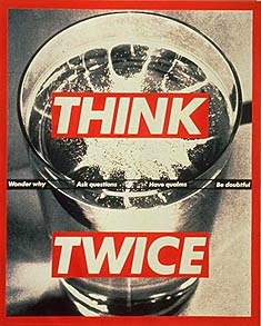
Above: Think Twice is a warning to women about the dangers of date rape drugs being spiked in drinks.  The big chunky text is glaring against the black and white, giving a loud and urgent message.  The visual rhetoric is further hinted at by the effervescent substance (intended to be perceived as a drug) that is dissolving on the surface of the water, suggesting that it will soon disappear and be undetectable.  

Fig. 8

We Don't Need Another Hero warns boys and young men that their idea of the "masculine" hero asserting his strength, sometimes in a threatening way, is no longer OK in society.

Fig. 9

You Are Not Yourself presents an image of a woman whose reflection has been fragmented in the mirror by impact to the glass, most likely a punch.  The cut up lettering further suggests turmoil and disorientation felt by the woman in the image.

Fig. 10

One of Kruger's best-known pieces, created in response to the anti-abortion debate.  The piece could be interpreted in many ways out of that context and still be successful, what with the issues that still surround negative body image issues in the Western World.  With pieces such as this one, the viewer has a direct response on an emotional level, which is what all of Kruger's work aims to do.


Fig. 11

Your Gaze Hits The Side of My Face is an emotional plea against catcalling and objectifying women.  To me, the use of the word "hits" suggests that it is a woman talking to a man, as the word has aggressive connotations usually associated with men.   

Fig. 12 
Probably one of Kruger's most overtly critical works,  Questions does exactly that - questions an American viewer's pride in their country through repeated asking of questions related to which groups in the country have the most freedoms or oppressions. "Look for the moment when pride becomes contempt" says to us that we must consider the unfairness of the social system in the US.  The composition mimics the national flag, a symbol of pride and freedom in America.  By turning it into an accusation of sorts, Kruger presents a harsh truth behind the "idealised " image of the American Dream.

To conclude this post on Barbara Kruger's approach, consider the quote: "I think there are lots of ways to make good work.  You can throw big bucks at a project and make what some would call crap, or you can work very modestly with eloquently moving results."  Krurger's work has been useful to look at as it is a very overt kind of graphic art, in that it is blatant about questioning and opposing social conventions.  I am interested to see how works like this could persuade a person to change or question a current opinion in comparison to more subtle works such as those of a subversive method.

References:

Macnevin, Suzanna, date unknown.  Barbara Kruger: The Art History Archive - Feminist Art. [online article] Available at:
http://www.arthistoryarchive.com/arthistory/feminist/Barbara-Kruger.html
[Accessed 7th November 2014]

Images

Fig. 1: 1991. All Violence is the Illusion of a Pathetic Stereotype [installation, online image] Available at: http://www.arthistoryarchive.com/arthistory/feminist/images/BarbaraKruger-All-Violence-is-an-Illustration-of-a-Pathetic-Stereotype-1991.jpg

Fig. 2:  All Violence is the Illusion of a Pathetic Stereotype [chess board]

Fig 3: 2007.  Face It (Cyan) [online image] Available at:
http://www.arthistoryarchive.com/arthistory/feminist/images/BarbaraKruger-Face-It-Cyan-2007.jpg
[Accessed 7th November 2014]

Fig. 4: 2007.  Face It (Yellow) [online image] Available at:
http://www.arthistoryarchive.com/arthistory/feminist/images/BarbaraKruger-Face-It-Yellow-2007.jpg
[Accessed 7th November 2014]

Fig. 5: 1987.  I Shop Therefore I Am.   [online image] Available at:
http://www.arthistoryarchive.com/arthistory/feminist/images/BarbaraKruger-I-Shop-Therefore-I-Am-I-1987.jpg
[Accessed 7th November 2014]

Fig. 6: 1990.  It's A Small World But Not if You Have To Clean It.  [online image] Available at:
http://www.arthistoryarchive.com/arthistory/feminist/images/BarbaraKruger-Its-a-Small-World-But-Not-If-You-Have-to-Clean-It-1990.jpg
[Accessed 7th November 2014]

Fig. 7: 1992.  Think Twice [online image] Available at:
http://www.arthistoryarchive.com/arthistory/feminist/images/BarbaraKruger-Think-Twice-1992.jpg
[Accessed 7th November 2014]\

Fig. 8: 1985.  We Don't Need Another Hero [online image] Available at:
http://www.arthistoryarchive.com/arthistory/feminist/images/BarbaraKruger-Untitled-We-Dont-Need-Another-Hero-1985.jpg
[Accessed 7th November 2014]

Fig. 9: 1984.  You Are Not Yourself.   [online image] Available at:
http://www.arthistoryarchive.com/arthistory/feminist/images/BarbaraKruger-You-are-not-yourself-1984.jpg
[Accessed 7th November 2014]

Fig. 10: 1989.  Your Body Is A Battleground [online image] Available at:
http://www.arthistoryarchive.com/arthistory/feminist/images/BarbaraKruger-Your-body-is-a-battleground-1989.jpg
[Accessed 7th November 2014]

Fig. 11: 1981.  Your Gaze Hits The Side of My Face.  [online image] Available at:
http://www.arthistoryarchive.com/arthistory/feminist/images/BarbaraKruger-Your-Gaze-Hits-the-Side-of-My-Face-1981.jpg
[Accessed 7th November 2014]

Fig. 12: 1991. Questions. [online image] Available at: 
http://www.arthistoryarchive.com/arthistory/feminist/images/BarbaraKruger-Questions-1991.jpg
[Accessed 7th November 2014]